10 Striking Examples of Anti-Marketing in Branding
May 2026
Honest branding is a strategy where a brand tells the truth about itself before the audience does. Self-deprecation, the rejection of empty promises, deliberate restraint in visual language. This is anti-marketing and that's exactly why it works better than any advertising.
Here are 10 brands that embedded this honesty into specific decisions: their visual identity, packaging logic, clothing design, and ad layouts. Every case is a real result you can measure.
01. Oatly · Packaging
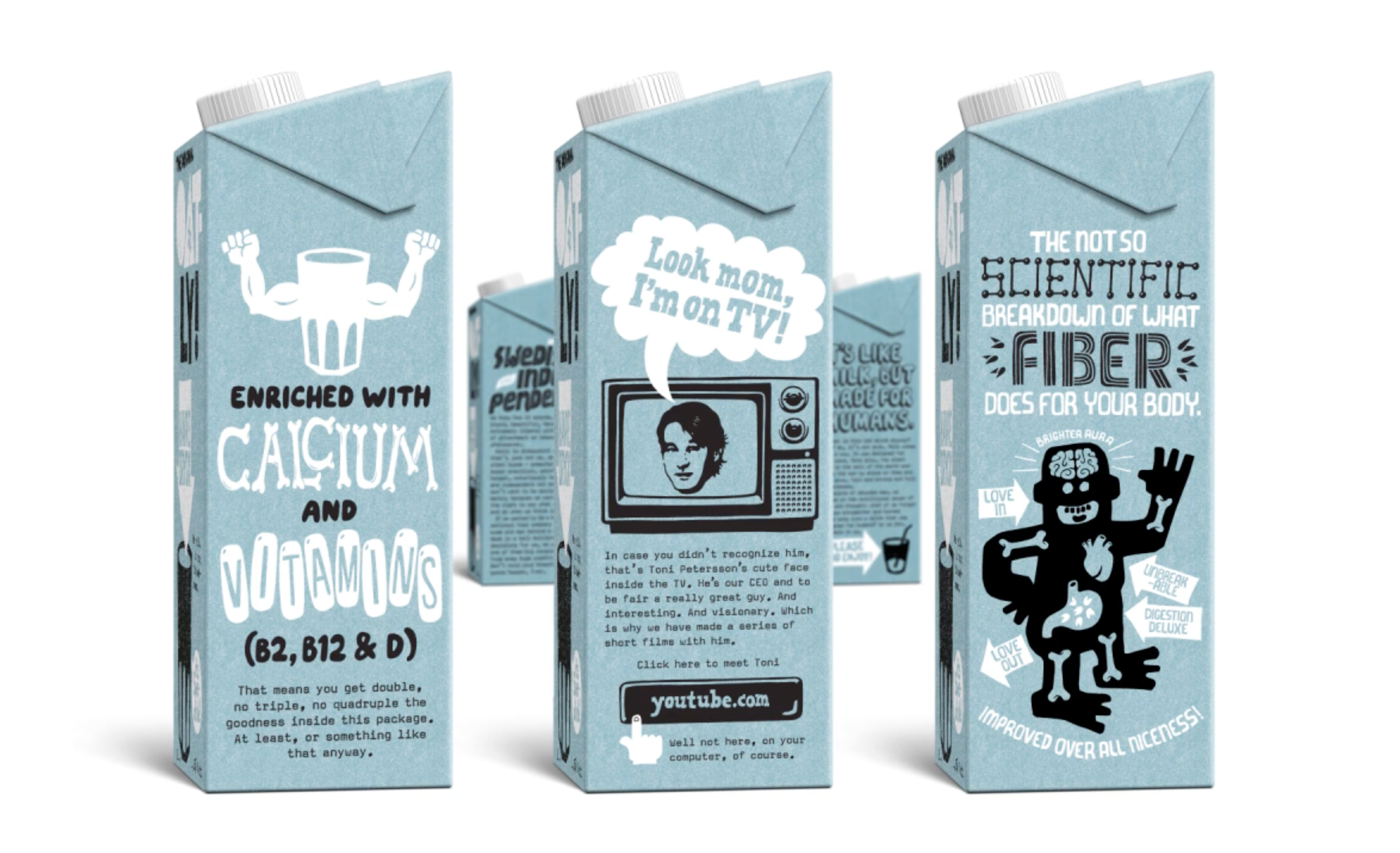
The Swedish oat milk brand scrapped its old packaging in 2015 and turned the cardboard carton into its primary media channel. The back panel is officially called the "boring side" right there in the design. The tagline "It's like milk, but made for humans" breaks every category rule: self-deprecation instead of benefits, conversation instead of authority. The custom Oatly Sans typeface was made deliberately imperfect: rough letterforms signal humanity where competitors reach for gloss. Each of the six sides of the carton carries its own distinct piece of copy. Oatly has no advertising budget in the conventional sense. The packaging is the advertising.
Design principle: packaging = free advertising space. Most brands use it for information. Oatly uses it for conversation.
02. Patagonia · Clothing · Ad
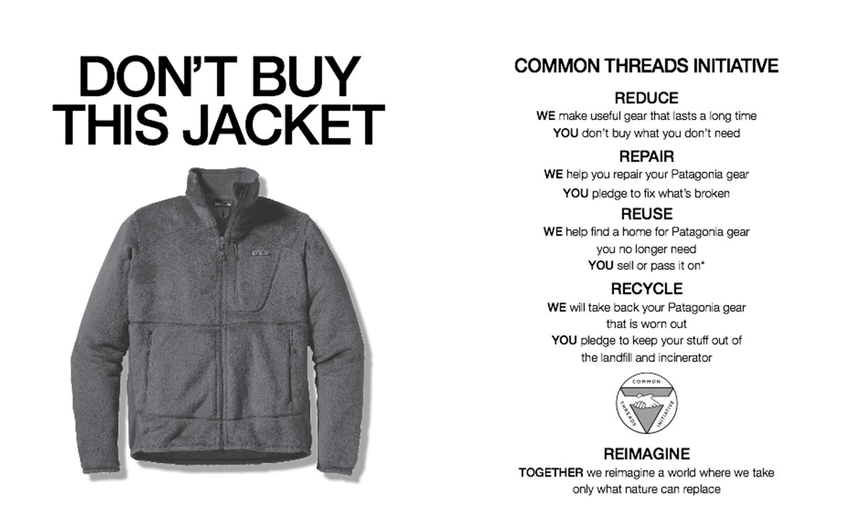
Black Friday, 2011. While every brand was running sales, Patagonia bought a full page in The New York Times with the headline "Don't Buy This Jacket." Below it a photo of their best-selling coat and a breakdown of the environmental cost of making it: 135 liters of water, 20 lbs of CO₂, manufacturing waste. The layout was deliberately serious newspaper format, no irony in the tone. The contrast comes entirely from a headline that contradicts the genre of advertising. That contrast made the campaign unforgettable. Sales rose 30 percent over nine months. By 2017, revenue hit $1 billion.
Design principle: form should amplify the idea, not explain it. Serious layout + anti-headline = maximum dissonance without a single joke.
03. Cards Against Humanity · Game · Website
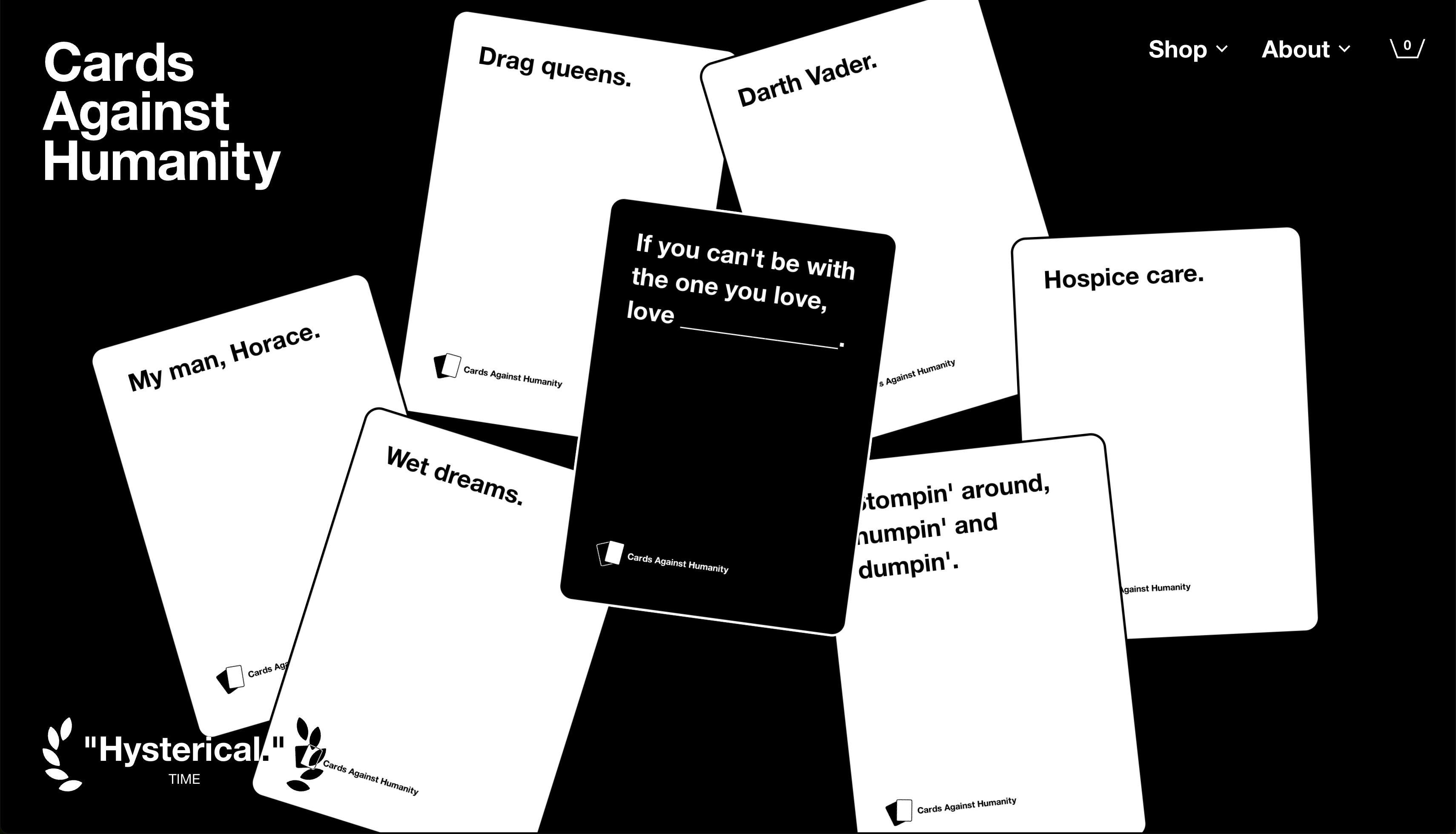
A card game tagged "for horrible people" that built its entire design system on one principle: maximally serious form + maximally absurd content. Their designer calls it the "Swiss design dungeon" strict black-and-white Helvetica, zero decoration, no illustrations anywhere. The humor lives exclusively in the text in the tagline, in the card descriptions, in the site's CTA. Instead of a standard "submit card," the button reads "submit bad idea." The site is deliberately designed to look like corporate documentation, and that contrast is exactly what makes every joke land. On Black Friday 2015 they sold literally nothing a blank page with a payment button and made $71,000.
Design principle: a serious container makes absurdity convincing. If the packaging were funny too, the joke wouldn't land.
04. Liquid Death · Beverage · Packaging
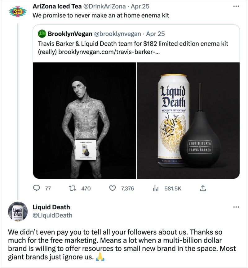
Water in an aluminium can with a skull and the tagline "Murder Your Thirst." The self-deprecation is baked into the product's very existence: the company sells the most boring product on earth water in heavy metal band packaging. Founder Mike Cessario called the idea "the dumbest name for water" and went with it anyway, because all the smart names were already taken. The can deliberately looks like an energy drink: same format, same aesthetic, but mountain water inside. The design system is relentlessly consistent: merch, skateboards, collaborations with Martha Stewart and e.l.f. Cosmetics all governed by one logic: maximum dissonance. The more unexpected the pairing, the wider the reach.
Design principle: if your product is indistinguishable from competitors in substance make it unmistakable in form. Liquid Death didn't improve the water. It improved the packaging.
05. Aesop · Skincare · Branding
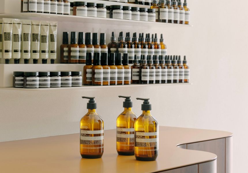
Aesop was founded in Melbourne in 1987 by hairdresser Dennis Paphitis, who was fed up with the "synthetic fragrances and exaggerated promises" of mainstream cosmetics. The solution: do the exact opposite. No models in advertising. No slogans. No discounts. No celebrities. Brand recognition rests entirely on one visual decision: amber glass bottles + black-and-white labels with nothing but the ingredients and instructions. That visual language hasn't changed since the brand was founded.
Aesop received B Corp certification in 2020 and deliberately barely mentions it in marketing. Their online journal The Fabulist publishes essays, book and music recommendations, and reportage no direct reference to products anywhere. Stores are designed by architects as cultural spaces: every one is unique, none repeat another. This is anti-marketing embedded in every brand touchpoint packaging, retail, content.
Design principle: in an industry where everyone shouts about results and benefits, silence is the loudest voice. An amber bottle with no tagline says more than any ad copy.
06. Muji · Packaging · Product
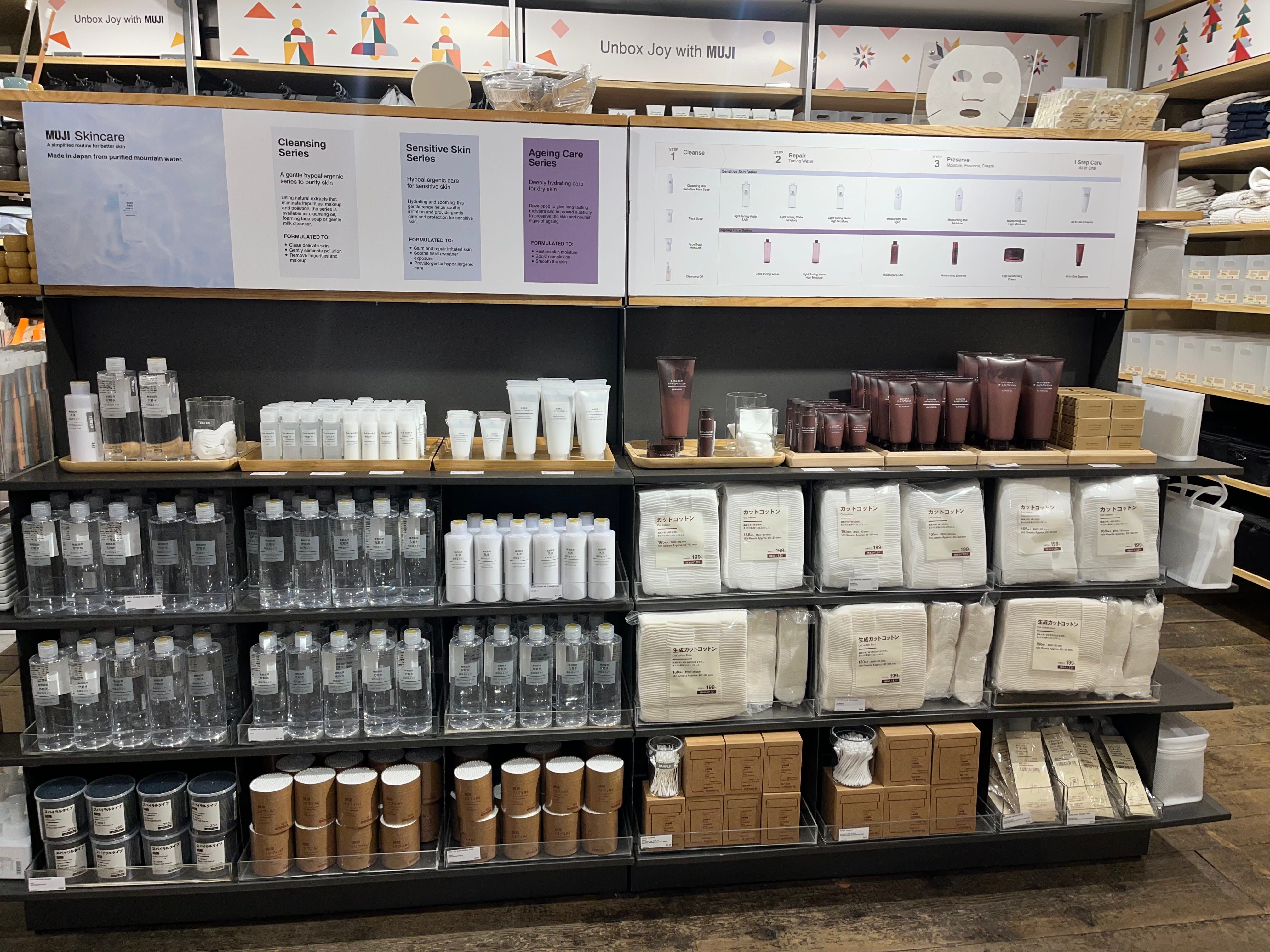
Muji (無印良品) translates literally: "no-brand quality goods." This isn't positioning it's a constructive principle built into every product since 1980. No logos on the products. Packaging is kraft paper and transparent cellophane, nothing extra. Color palette: white, beige, natural. Art director Kenya Hara describes the philosophy not as "minimalism" but as "emptiness": the product should be a vessel the buyer fills with their own meaning.
Muji spends no budget on conventional advertising the design sells the products. Stores feel like exhibition spaces. They even sell U-shaped spaghetti offcuts from straight pasta production that would otherwise be thrown away. Anti-branding became the strongest brand: over 1,000 stores in 45 countries today.
Design principle: removing the unnecessary is also a decision. Empty space and kraft paper speak louder than the most expensive gloss.
07. Everlane · Clothing · Website
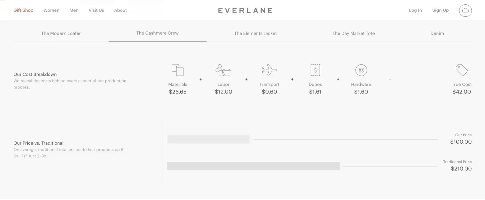
Everlane is a DTC clothing brand that built its entire site design around "radical transparency": every product card shows the real cost breakdown materials, labour, logistics, duties. Next to it: their price and a comparison with the industry standard. Everlane's markup is 2×; the industry standard is 8–10×. This isn't text buried in an "About Us" page — it's the central element of the product page, built into the UX.
The "Our Factories" page was an interactive map with photos of every factory, workers' names, and descriptions of working conditions. The "Choose What You Pay" feature offered three price tiers with an explanation of where each level of markup goes. An industry that hid its cost structure for a century met a brand that made it the primary visual element.
Design principle: take what everyone hides and make it the main element of the interface. Honesty as a UI decision works better than honesty as copywriting.
08. Innocent Drinks · Packaging
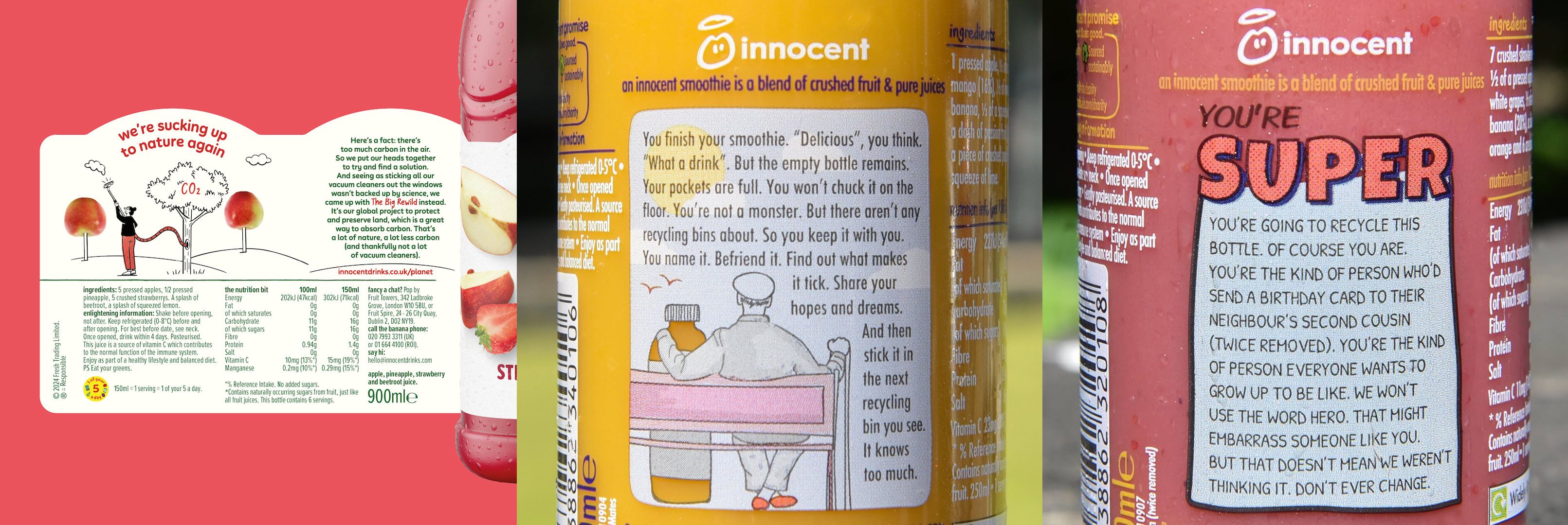
The British smoothie maker has used every surface of its packaging as a place for conversation since 1999. On the bottom of the bottle: "Stop looking at the bottom. Drink me instead." On the cap: "Hello. Am I what you're looking for?" On the side panel you can find various funny messages, often about the importance of recycling and caring for the environment. This is Oatly's predecessor — the same packvertising mechanic, just 16 years earlier. Innocent were the first to understand: the person holding the bottle is the most attentive reader in the world. That moment of attention is too valuable to waste.
Design principle: the person holding the bottle is the most attentive reader in the world. Don't waste that moment.
09. Lush · Cosmetics · Packaging
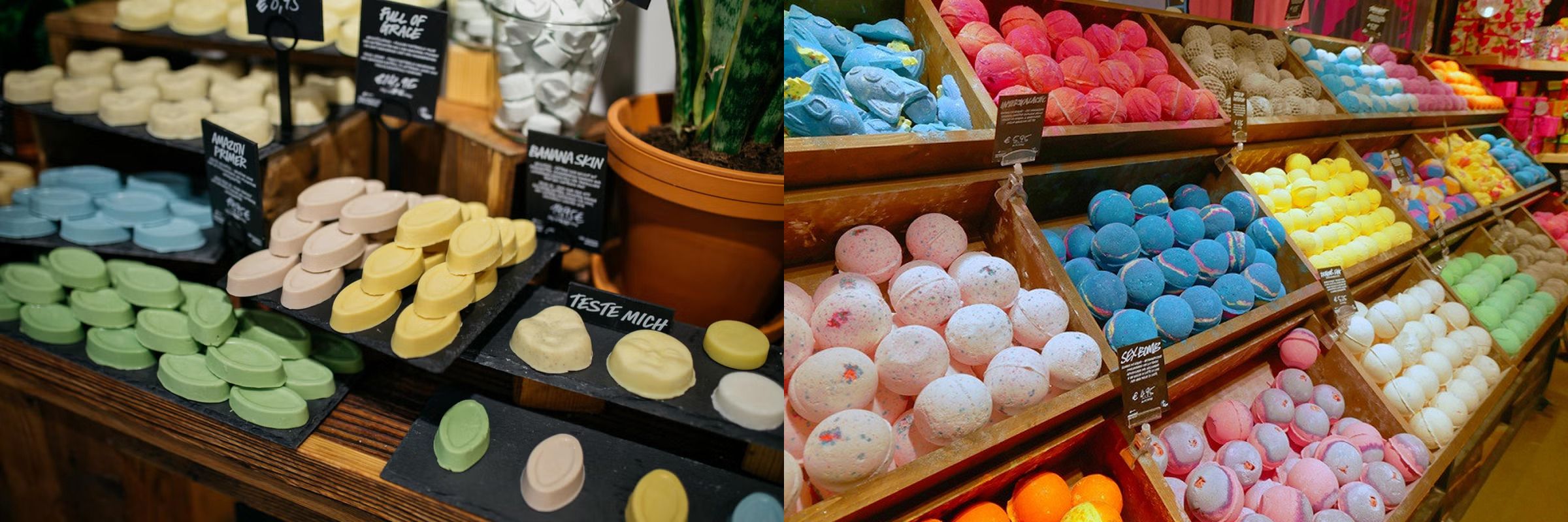
The British cosmetics brand launched the Naked line — products with no packaging at all. Shampoo bars, soaps, and bath bombs sit on open shelves like works of art — you can touch and smell them right in the store. This isn't just an eco decision: it's a design statement that the product is good enough on its own. Lush stores deliberately look like cheese or bread markets — no gloss, no closed boxes. 85 percent of the brand's products require no packaging at all. The absence of packaging is the packaging.
Design principle: the absence of packaging is also a design decision. Sometimes the boldest one.
10. Volkswagen Beetl · Advertising
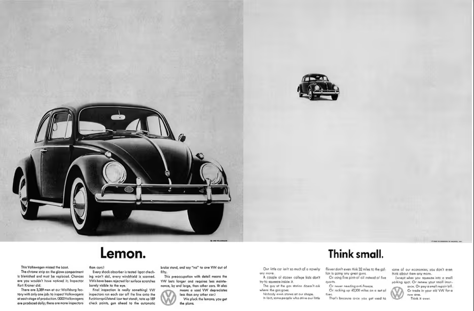
"Think Small" (1959, DDB) — the ad that started anti-marketing as a phenomenon. In an era when everyone was selling big, gleaming cars, DDB placed a tiny Beetle on an almost blank white page with one headline: "Think small." Minimal text, Helvetica, enormous empty space. The main disadvantage — size — was named first and turned into a value: economy, honesty, simplicity. Ad Age ranked the campaign first among the best ads of the 20th century. It's the template every other case in this article follows.
Design principle: name the flaw first — and the audience will stop seeing it as a flaw.
Why anti-marketing works — and always will
All 10 cases share one thing: they tell the truth. Oatly admits that marketing is a bit absurd. Patagonia admits that production harms the environment. Cards Against Humanity honestly says "this is a terrible idea." Volkswagen says "we're small." And that honesty — deliberately embedded in the form of the design, not just the copy — creates trust that no ad budget can buy.
Anti-marketing isn't a strategy for the brave. It's a strategy for the confident. Only a brand that truly believes in its product can afford to say "don't buy it" — and that's exactly why people believe it.
Notice the shared design pattern across every case: the form stays serious, the content doesn't. CAH's strict black-and-white Helvetica. Patagonia's newspaper layout. Muji's kraft paper with no logo. Everlane's cost breakdown as the central product page element. Aesop's amber bottle with no promises. A serious container makes the anti-marketing message convincing. If the form were joking too, the trust would collapse.
For a designer this means one thing: anti-marketing is above all a visual decision, not a copywriting one. Where to place the text, which typeface, how much space to leave — all of it determines whether the idea works.
When you present a case like this to a client, the presentation itself needs to match the level of the idea — visuals placed in real context, on a shelf, in hands, on a surface. ls.graphics has professional mockups for exactly that: collections covering branding and packaging scenarios. And the Mockup Plugin for Figma lets you apply your design to any surface directly in your workspace. Because honest branding deserves an honest presentation.
High-end mockups for serious design work
Start
Edit mockups online — in browser
- Online Mockup Editor
- PNG/JPG Export
Pro
Full access to all resources and tools
- Everything in start
- Download PSD, Sketch, Figma Files
 Mockup Plugin for Figma Access *
 mckp.live Access *
* Included in Pro — activate with a one-time account connection in your profile
Start
Edit mockups online — in browser
- Online Mockup Editor
- PNG/JPG Export
Pro
Full access to all resources and tools
- Everything in start
- Download PSD, Sketch, Figma Files
- Mockup Plugin for Figma Access *
- mckp.live Access *
* Included in Pro — activate with a one-time account connection in your profile
What designers say
Chosen by creators from top platforms
*You will need to connect online tools in yourprofile. The standard VAT rate may be charged, following the law of your country