Branding Mockups: 7 Ways to Present Your Design to a Client
2026-07-11T11:43:15.343ZThe client nods at the brand book. Then asks you to redo everything
You know the scene: you send the client a logo, a color palette, and clean guidelines on a tidy white background. They say "looks good" — and two days later come back with feedback you can't quite argue with. "Something's off." "It's not clicking." "Can we try a different font?"
The problem is almost never the design. The problem is that the client never saw their brand alive.
They saw an icon in a vacuum — not a sign mounted over a busy street, not a coffee cup catching light on a car hood, not a shopping bag held up against a bold orange backdrop.
Branding mockups fix exactly this. Below are seven real scenes that walk a brand through the same route it takes in real life: from the street — into someone's hands — into their day — and, eventually, onto the shelf and onto their head.
One brand's journey: from the street to someone's head
We put this set of branding mockups together not as a random list, but as a journey:
1. First, the brand meets you outdoors — the billboard.
2. Then it makes an impression through print — magazine, business card.
3. It becomes part of an ordinary moment — the coffee cup.
4. It gets carried around — the shopping bag.
5. It shows up on the shelf — the pouch.
6. And finally, people choose to wear it — the bucket hat.
This isn't just a nice structure for a blog post — use it on your next client call as a quick story about where their brand actually lives.
The seven mockups
1. Bridge Billboard Mockup: three seconds to grab attention
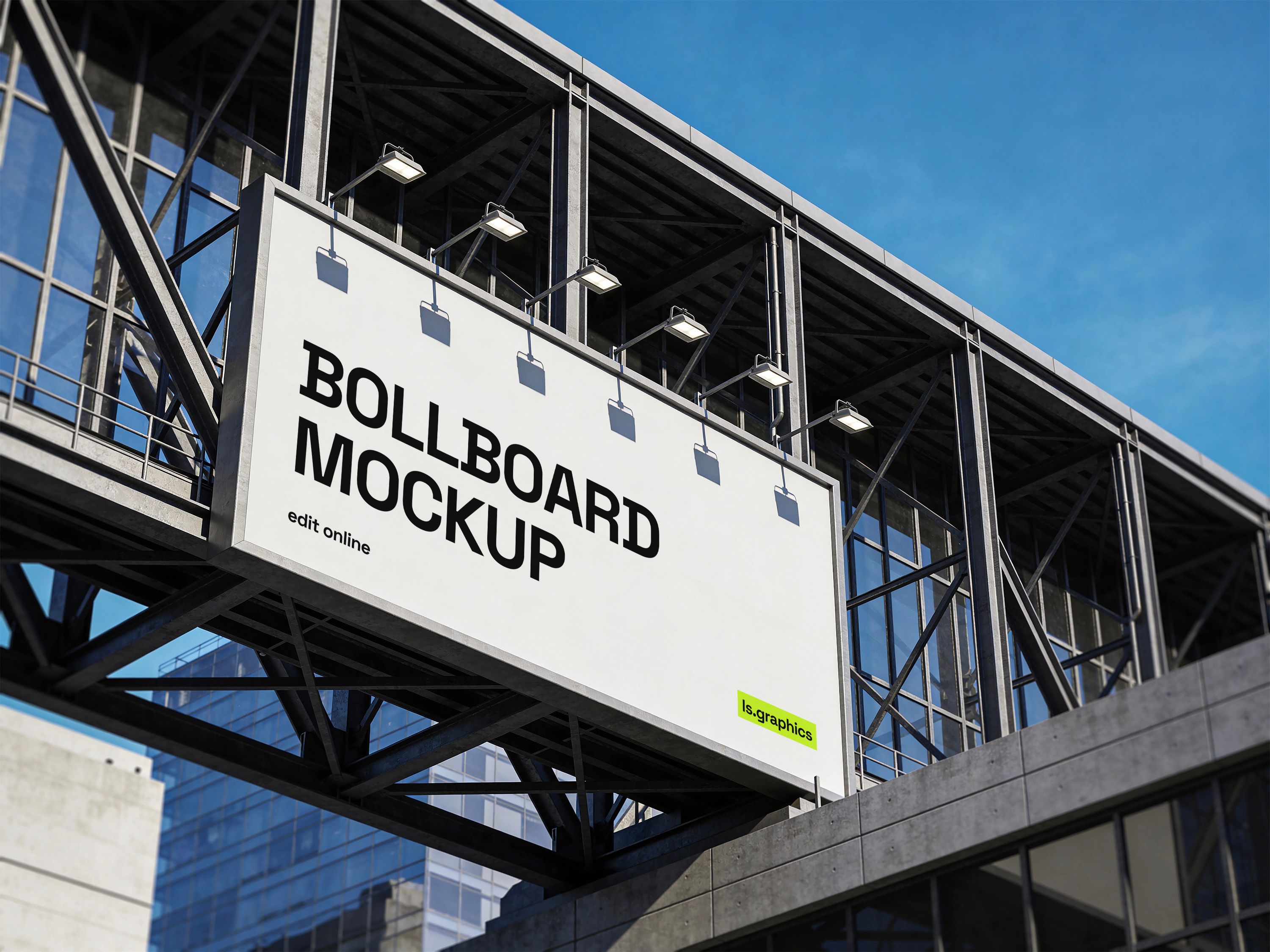
A driver stuck in traffic glances up at a billboard mounted over the street for two or three seconds — tops. No time to read fine print or admire details. Either the logo and color register instantly against the city skyline behind it, or the whole thing turns into a colorful blur.
This mockup places the design on a large-format billboard fixed to a modern urban building, with the kind of architectural backdrop that makes a client stop scrolling. It's a great way to prove that boldness in design isn't a whim — it's a requirement for outdoor advertising.
2. Magazine on Armchair Mockup: a slower, more convincing medium
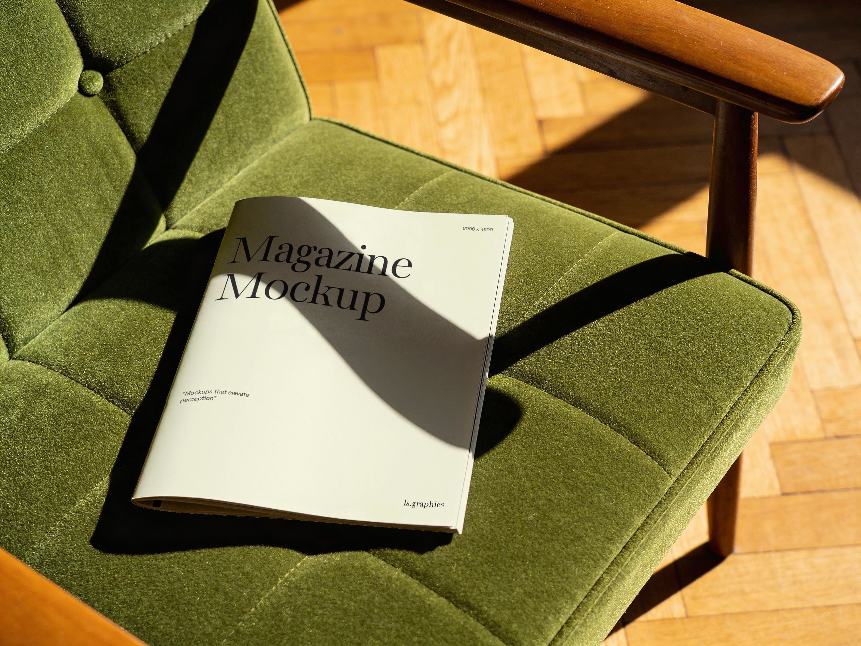
If a billboard is about three seconds, this scene is about the opposite instinct entirely: a magazine resting on a green velvet armchair, lit by warm natural light. There's no reader in a rush here — just a quiet, editorial moment that makes the cover feel like it belongs in someone's actual living room, not a newsstand rack.
That distinction matters. Brands shown in a lifestyle setting like this one read as established, considered, already trusted — which is exactly the impression fashion, beauty, and lifestyle clients are chasing.
3. Business Card Mockup: a brand you can actually touch
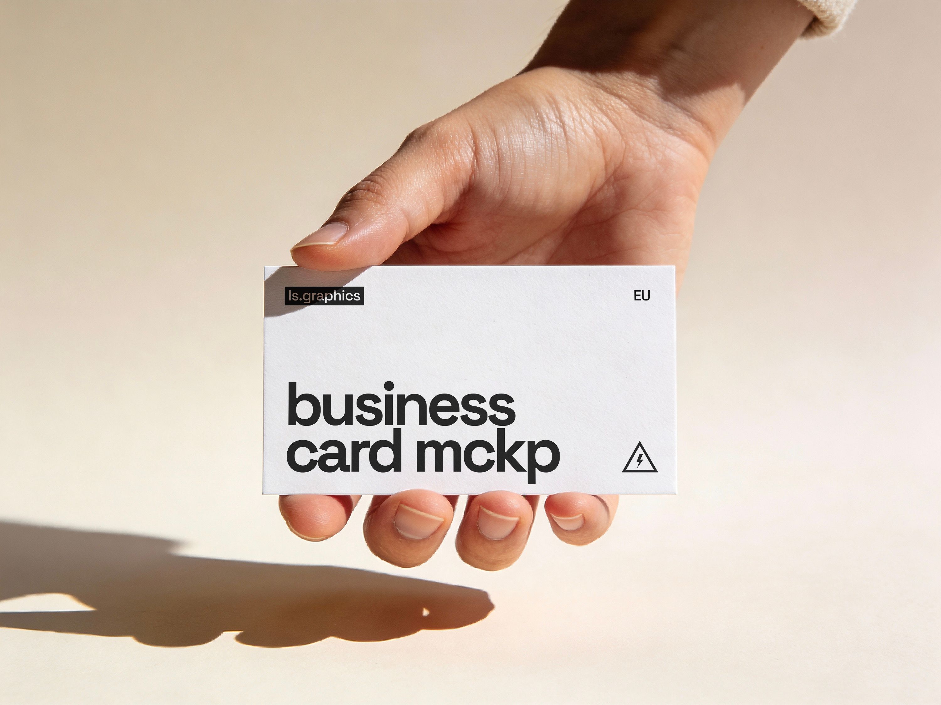
Out of this whole set, this is the only mockup where the brand literally ends up in someone's hands — not on a screen, not from a distance, but between their fingers, against a soft neutral background. Paper weight, embossing, minimalism versus richness — every one of these details decides whether the card reads as "serious B2B" or "made in five minutes."
👉 Check out Business Card Mockups →
4. Coffee Cup Mockup: a brand caught in an ordinary moment
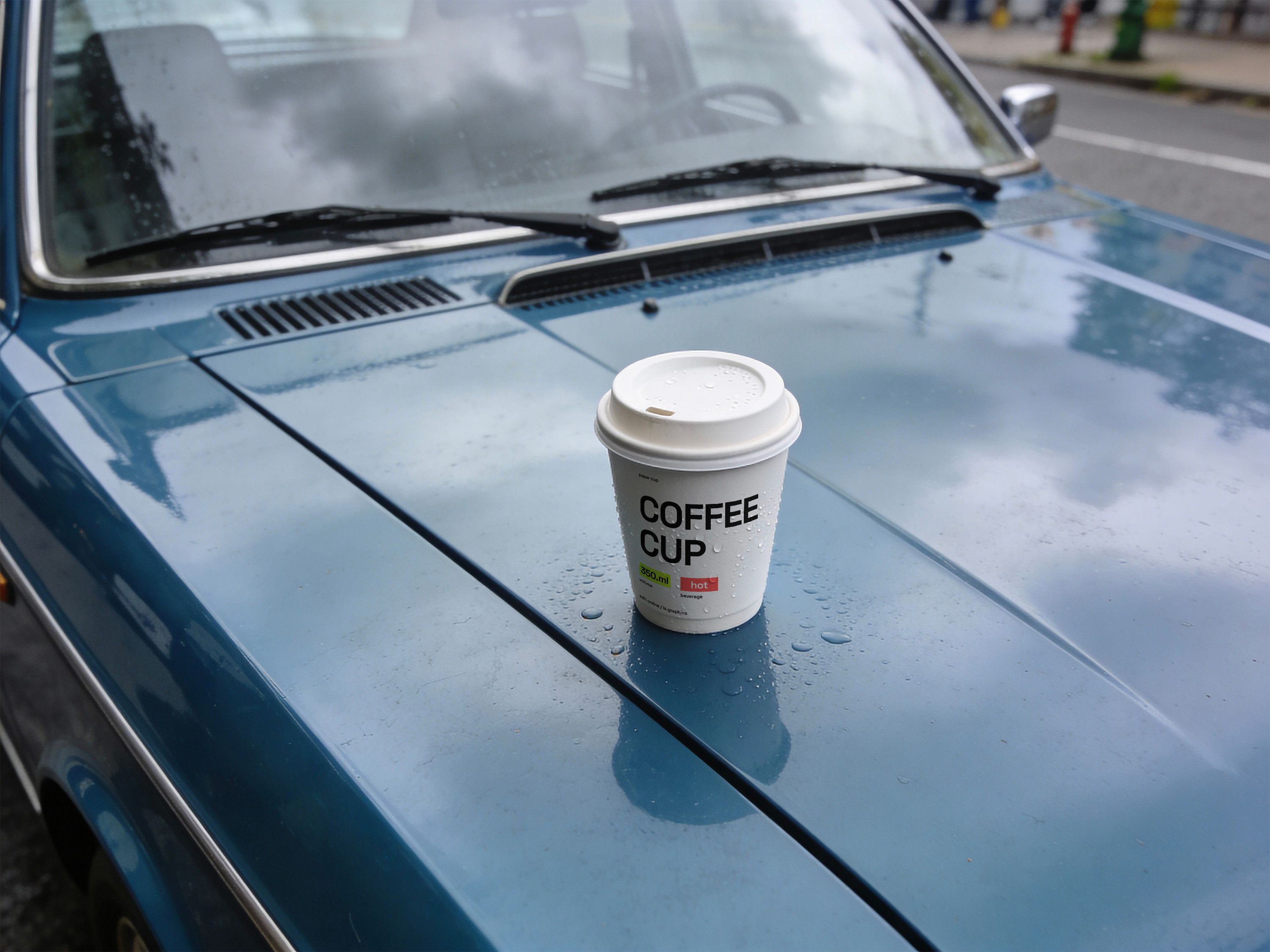
This one isn't styled like an ad — it's styled like a photo nobody planned to take. A white takeaway cup, sitting on the hood of a vintage car after the rain, water droplets and soft reflections doing most of the work. It's the visual opposite of a studio shot, and that's exactly the point.
Any brand that wants to feel like it belongs in someone's actual day — not like a billboard shrunk down to cup size — benefits from this kind of quiet, cinematic context.
👉 Take a Closer Look at Food Packaging Mockups →
5. Shopping Bag Mockup: turning a person into a walking ad
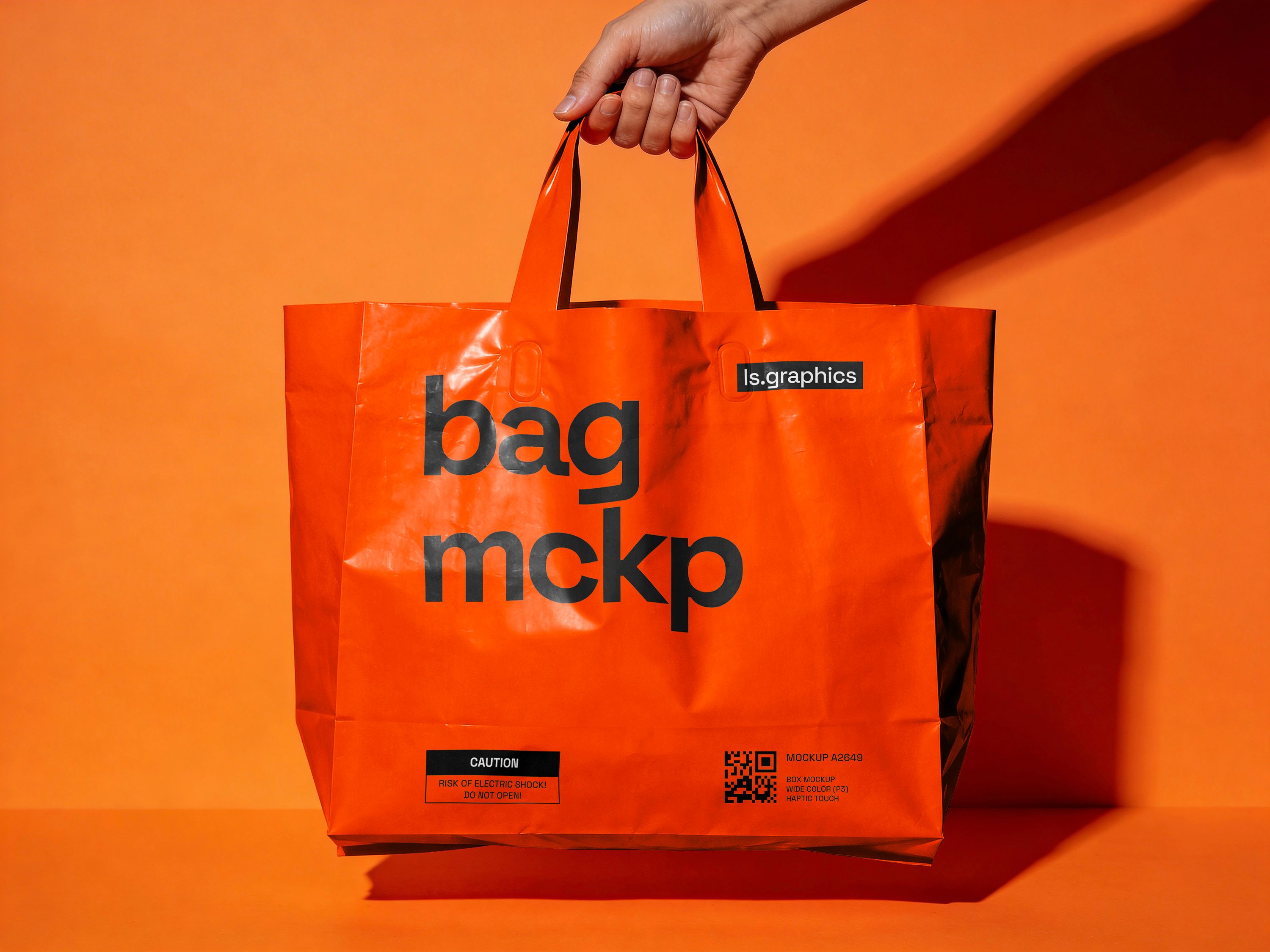
Held in hand against a bold orange backdrop, this glossy shopping bag mockup leans into strong directional lighting and deep shadows to make the print pop. The glossy material adds realistic reflections and texture — the kind of high-contrast, punchy styling that suits retail, fashion, and e-commerce brands that want to look modern rather than modest.
It's a good stress test for typography, too: a bold logo either holds its own against that much contrast and shine, or it gets swallowed by the glare.
👉 See Print Mockups Up Close →
6. Pouch Bag Mockup: three seconds on the shelf that decide everything
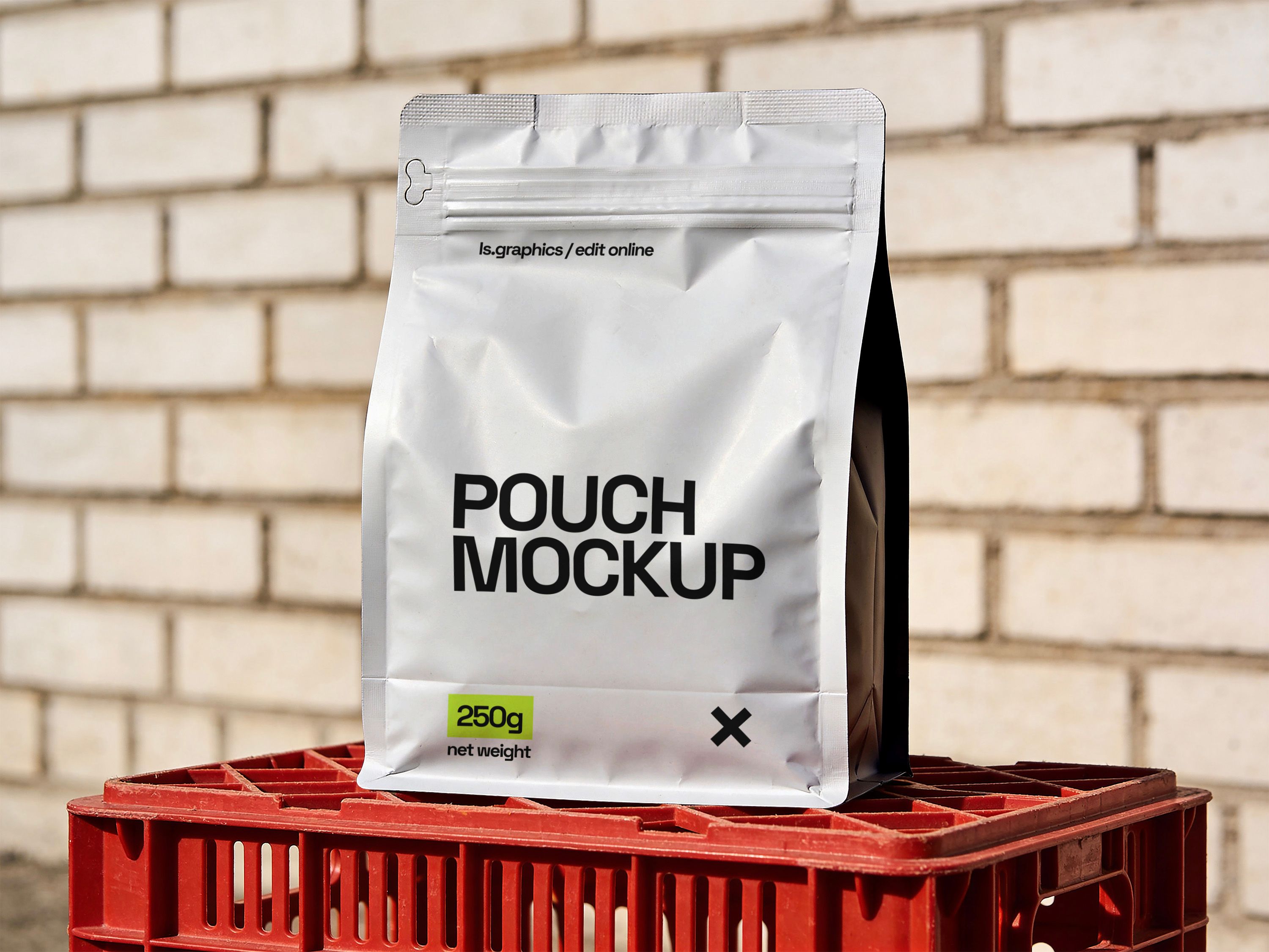
The toughest leg of the journey — the moment a brand competes with a dozen neighbors for a fraction of a second of a shopper's attention. This scene places a stand-up pouch on a crate against a brick wall, the kind of clean industrial styling that works for coffee, tea, snacks, supplements, or pet food packaging. "Looks nice in a presentation" doesn't help here. "Stands out among twenty similar pouches on the same crate" does.
7. Bucket Hat Mockup: the one people choose to put on
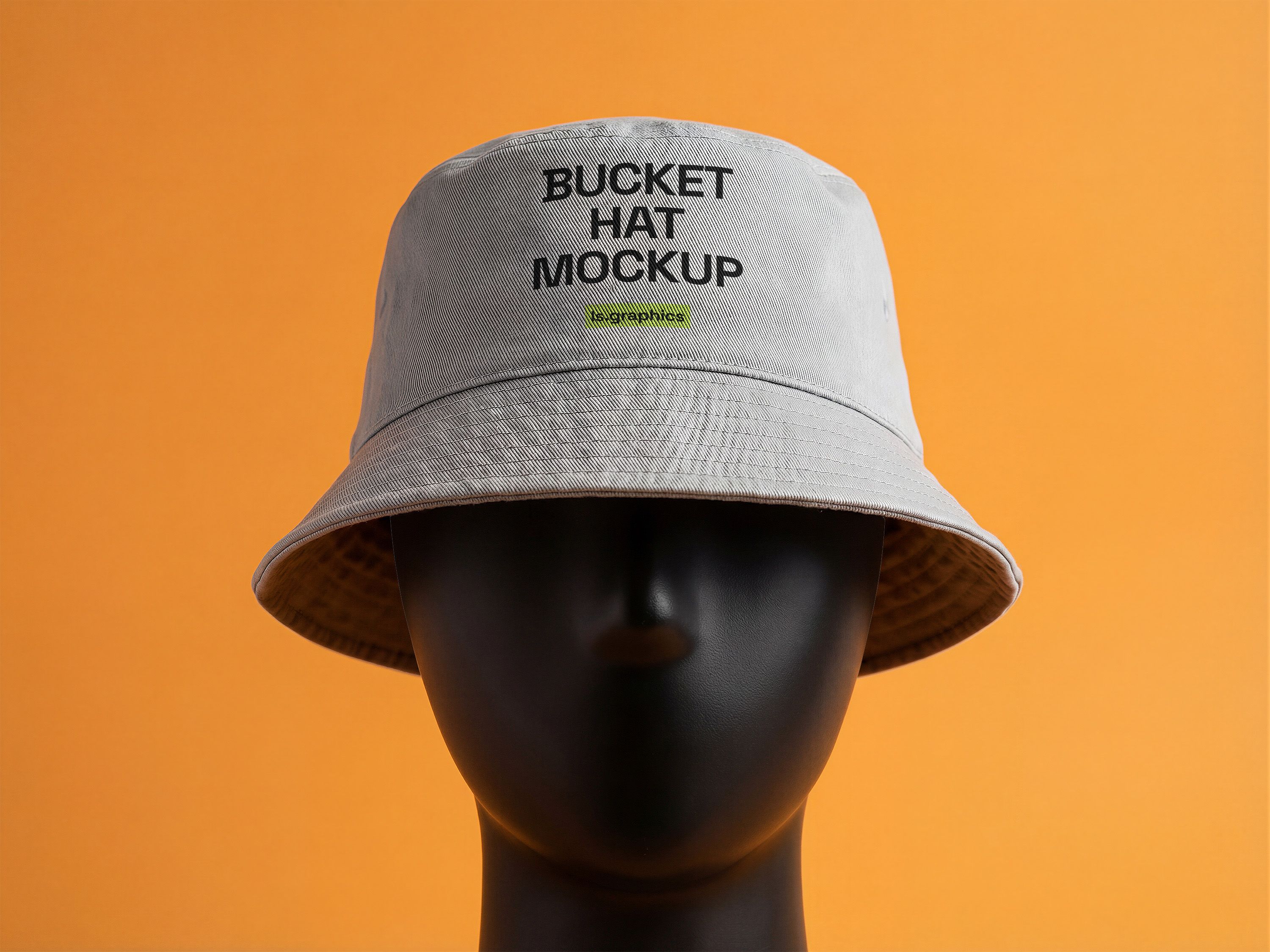
People wear hats for one reason — because they genuinely like the design, not because someone made them. Shown on a mannequin against a vibrant studio background, this mockup is an honest test: a logo on that small a surface either works, or it turns into a blur of stitching.
If a logo survives being embroidered onto a bucket hat and stays recognizable, it can survive pretty much anything.
A checklist before your next presentation
Before you show a brand to a client again, check whether the whole route is covered:
- Outdoor advertising (billboard, signage)
- Print and lifestyle settings (magazine, business card)
- An ordinary, everyday moment (coffee cup, street scene)
- Merch people actually carry or wear (shopping bag, bucket hat)
- Product packaging (pouch)
Missing a piece? No need to render it from scratch — the catalog already has ready-made scenes for every stop on the route.
A brand doesn't live in a brand book
A client doesn't compare one logo to another — they compare a feeling.
The feeling you get seeing a brand on a billboard on your way to work, holding its cup on a rainy afternoon, reaching for its pouch on a shelf.
The more of those moments you show upfront, the fewer chances you'll hear "redo everything" with no real explanation behind it.
All seven branding mockups are already in the catalog — grab them and drop in your own design in a couple of minutes.