

Brand guidelines: what to include, with examples
Brand guidelines are a short document that tells anyone using a brand how to apply it: which logo versions exist and where each goes, the color values, typefaces, imagery style and voice. Good guidelines show every rule on a real object, such as a card, a bag or a screen, so people copy the example instead of guessing.
What are brand guidelines, and are they the same as a brand book?
Brand guidelines, a brand style guide and a brand book are three names for the same thing: the rules for using a brand's logo, colors, type, imagery and voice. Some agencies call the short version "guidelines" and a longer one with the brand story a "book", but there is no fixed line between them.
What matters is who reads it. A printer needs color values and file formats. A social media manager needs the logo on dark and light backgrounds and a few lines of copy. A developer needs hex codes and font files. Write for those readers, not for the client's shelf.
What should brand guidelines include?
Include the parts someone needs to make a new piece without asking you: the logo and its rules, the color palette with exact values, typography, imagery, voice and examples in use. Keep it as short as those needs allow: a small business can often work from a handful of pages.
- Logo: the main version, the one-color version, the reversed version for dark backgrounds and the icon or short mark if there is one.
- Logo rules: clear space around the mark, the smallest size it stays readable at, and a short list of what not to do (stretch, recolor, add a shadow, place on a busy photo).
- Color: each color with HEX and RGB for screens, CMYK for print and a Pantone reference if the client prints spot colors. Say which color is primary and roughly how much of each to use.
- Typography: one or two typefaces, the weights in use, and a sample of a heading, a subheading and body text. Name a fallback font for email and office documents.
- Imagery and graphic elements: photo style, patterns, icons and shapes, with two or three right and wrong examples.
- Voice: three or four words that describe how the brand writes, and one short before and after rewrite.
- Applications: the identity on stationery, packaging, signage, merchandise and screens.
Leave out anything nobody will check. A rule about the exact angle of a photo is ignored; a rule about the logo on a dark background is used every week.
How do you set color and type rules that people follow?
Give exact values and show the pairs that work. People follow rules they can copy: a hex code, a font name and a ready example of text on a colored background are used, while "use the blue sparingly" is not.
- Check every text and background pair you recommend for contrast. The WCAG standard asks for a ratio of at least 4.5:1 for normal text and 3:1 for large text, and many brands fail it with light gray type or a pale accent color.
- List the approved pairs as a short grid in the document: which text color goes on which background.
- Convert print colors yourself rather than leaving it to each printer, and note that the CMYK version will look duller than the screen.
- For type, give sizes for the main uses: a heading, body text and a caption, in px for screens and pt for print.
How do you show the brand in use?
Show each rule on the objects the brand will appear on, using a mockup for each. A logo on a white page does not tell a team how it should sit on a tote bag, a box lid or a phone screen, and an example on the real object answers that at a glance.
Pick the client's real touchpoints. A café needs a cup, a bag and a sign; a studio needs a business card, letterhead and a website on a laptop. Use one lighting and backdrop style across the pages so the section reads as one system, and put the rule next to the picture: "logo centered, 30% of the bag width, one-color version".
How do you put the identity into a mockup?
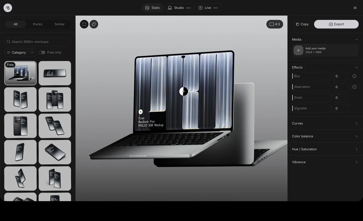
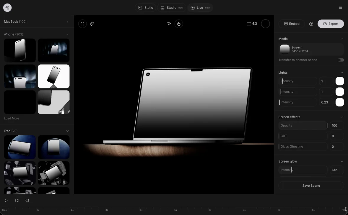
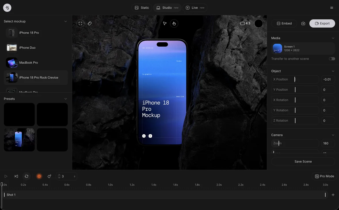
In the online mockup generator you choose a scene, drop your logo or layout onto it and export a PNG, a layered PSD, an SVG for Figma or a video, all in the browser. The branding mockups cover stationery, bags, boxes and signs, and the guide Create your first mockup walks through the first one step by step.
Export the logo as SVG or as a PNG with a transparent background so the paper or fabric shows through. Make the same scene twice when it helps, once with a correct use and once with a common mistake, and label them.
How do you make brand guidelines step by step?
Collect the finished assets first, write the rules second and design the document last. Starting with the layout tends to produce a pretty file that is missing the hex codes.
- Gather the approved logo files, colors and fonts from the identity project.
- Write each rule as one plain sentence, then check it against a real use: would a printer or a developer know what to do?
- Make the application pages with mockups of the client's touchpoints.
- Lay out the document with one rule and one example per page where you can.
- Export a PDF for reading and a folder with the logo files (SVG, PNG, PDF), font licenses or links and a color file.
- Walk the client through it once. The guidelines are often the last thing in a brand identity presentation, and that meeting is where you find the rule nobody understood.
Brand guidelines examples
These scenes from the ls.graphics library cover the application pages of a brand book. Each is a 3D render where you add your own logo and layouts:
- Letterhead: an A4 sheet resting on a mustard velvet chair
- Envelopes: navy envelopes on a wooden cabinet in soft shadow
- Business cards: a stack of cards on a dark green chair
- Merchandise: a tote bag on a wooden slat wall
- Packaging: a box with a pull tab on a round table
- Signage: a blank lightbox on a pole against a pale sky
Guidelines are also a strong case study. If you are putting the project in a design portfolio presentation, two or three of these pages show more of your thinking than the logo alone.
FAQ
How long should brand guidelines be?
As long as the rules people need and no longer. A small shop can manage with a few pages covering the logo, colors, type and a handful of applications; a company with many products and teams may need a longer document or a website.
Is there a brand guidelines template?
Many design tools and marketplaces offer one, and it helps with the layout. The content still has to come from the identity you made: the real color values, the real logo versions and the client's own touchpoints.
What is the difference between brand guidelines and a brand identity?
The brand identity is the set of visual and verbal pieces: the logo, colors, type, imagery and voice. The guidelines are the instructions for using them, so the identity looks the same whoever applies it.
Should brand guidelines be a PDF or a website?
A PDF is enough for most small brands and is easy to send to a printer. A website suits a company where many people make materials, since it can be updated in one place and can host the downloadable files.