Sketch vs. Figma vs. Photoshop: Where to Work with Mockups in 2026
2026-08-27T15:33:40.868ZEvery designer has had that moment: you need to put together a mockup — a screen layout, a packaging comp, a page — and you're staring at a blank canvas, realizing you haven't even decided where to actually work on that mockup. Mockups come in very different shapes: device mockups for presenting an interface, branding mockups for a client pitch, stationery mockups and print mockups for the printer, and even just free mockups you can download and adapt quickly when there's no time or budget to build one from scratch. Sketch, Figma, and Photoshop have long felt like three different colleagues to designers, each with its own approach to working with mockups. None of them is "bad" — the mockups they help you build are simply different by design. To figure out where your particular mockup should live, it helps to get to know each tool a little better.
Sketch: the quiet perfectionist who hates clutter
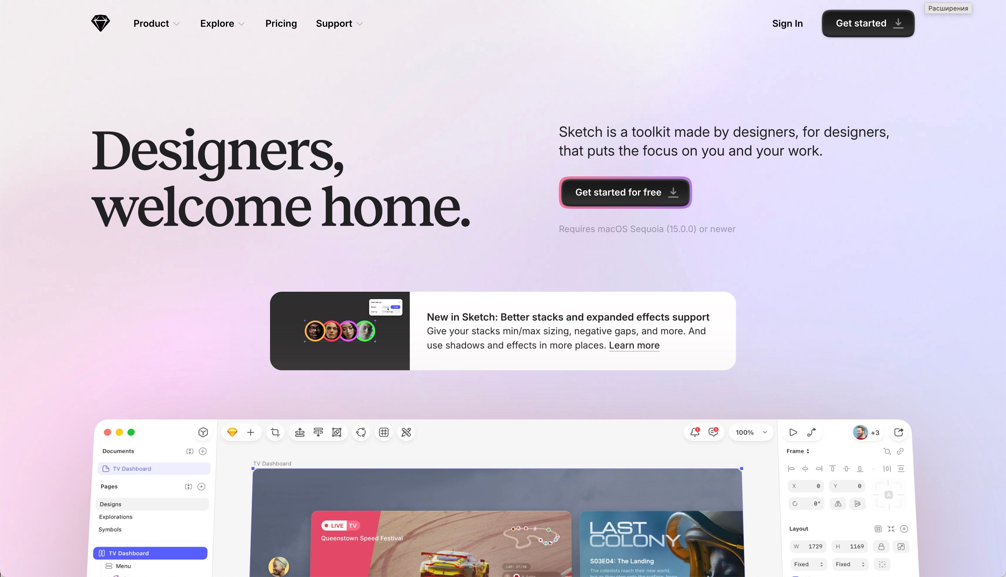
Let's start with the veteran of interface design. Sketch appeared back when designers were still arguing over whether interface mockups really needed a dedicated tool at all, or whether a general-purpose graphics editor would do. Sketch's answer was simple: yes, they do, and here it is. From day one, the program stripped away everything unnecessary — no photo retouching, no print tools, no 3D. Just what's actually needed to put together a screen or app mockup quickly, including the classic device mockups where an interface sits neatly inside a phone or tablet frame. That's why Sketch is often compared to someone who does one thing, but does it so well that switching to anything else feels unnecessary.
That focus on interface mockups became both its greatest strength and its biggest limitation:
Pros
- A clean, minimalist interface with no visual clutter
- Fast, predictable work with symbols and reusable components
- A huge plugin ecosystem, built up over years
Cons
- Runs only on macOS — a team with even one Windows machine will need to compromise
- Real-time collaborative editing of a shared mockup is weak
- After major updates, older projects can behave unpredictably: corner radii reset, symbols shift
Even so, this "do one thing perfectly" philosophy made Sketch the tool of choice for major tech companies building interface mockups for a long time.
Real-world example
Apple, Facebook, and Google kept Sketch in their toolkit for years to mock up apps and websites — largely because their design teams historically worked on Mac and valued the exact kind of vector precision Sketch was built around.
Figma: the colleague a distributed team couldn't survive without
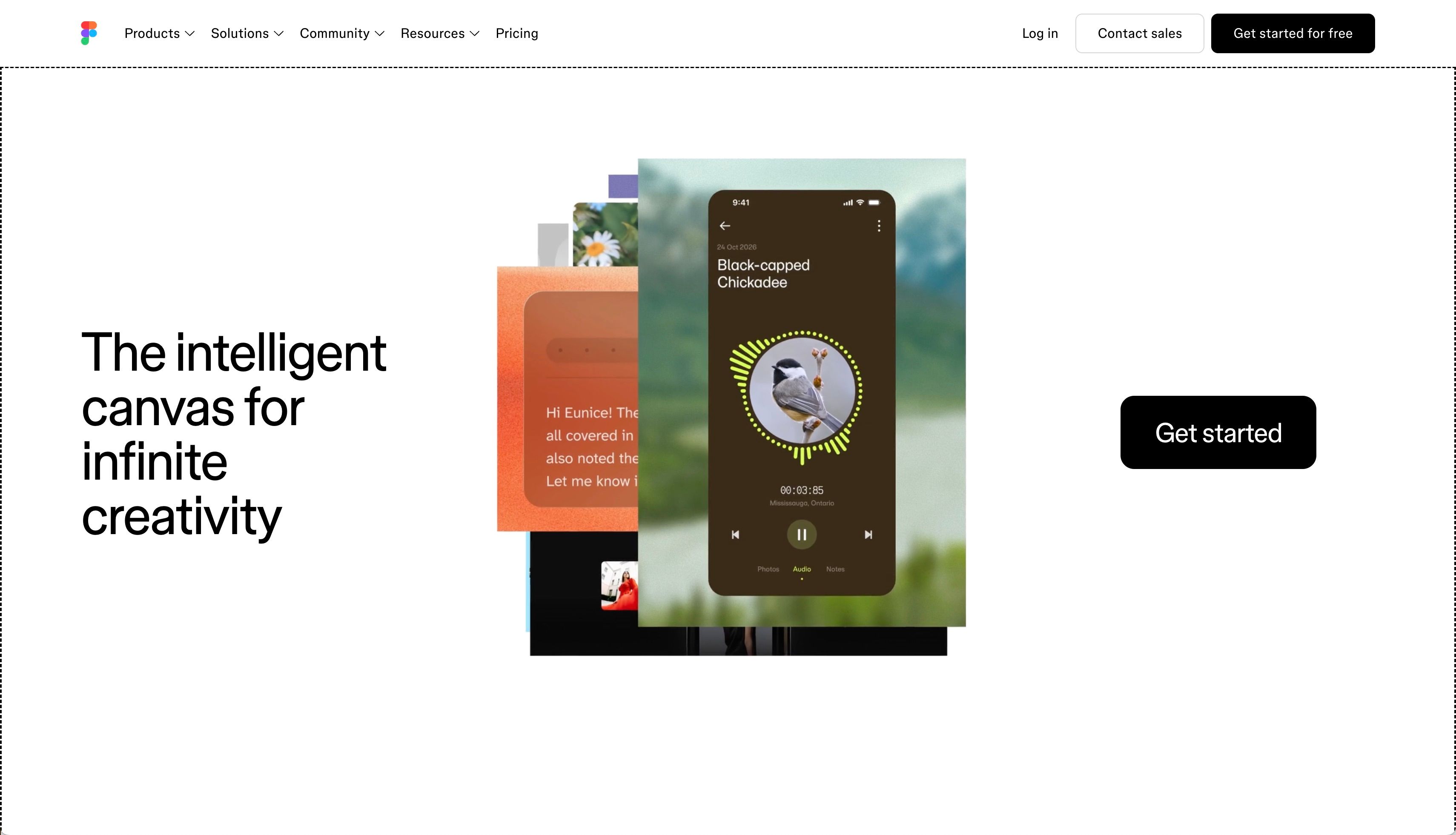
If Sketch is the quiet introvert, Figma is its complete opposite. It arrived just as the industry was shifting en masse to remote work, and it offered something that had been missing: the ability for several people to work inside the same mockup at once, see each other's cursors, and hash out layout details right in the comments instead of an endless chain of emails. Figma is also where most device mockups get built today — from a single screen to a full flow of states across multiple devices.
Running in the browser is a foundational choice — one that erases the question "what operating system are you on?" for good when a whole team is working on one shared mockup:
Pros
- The mockup opens in a browser on any OS
- Multiple people can edit one file at the same time, without an endless string of "final_final_v3" files
- Built-in prototyping and easy handoff of mockups to developers
- Fast-evolving AI features that speed up repetitive work
Cons
- Without a stable internet connection, working on a mockup is nearly impossible
- The richest collaboration features usually sit behind paid tiers
- Falls short on photorealistic image processing
That combination of strengths is exactly what made Figma the backbone of large, distributed teams that need to align on mockups fast.
By the way, if you're already working in Figma, you don't have to build a device mockup from scratch by hand — plugins can do the heavy lifting right inside the editor. One worth knowing about is the Figma plugin by ls.graphics, which drops a screen into a ready-made device frame in a couple of clicks without ever leaving the file.
Real-world example
Figma became the primary tool for building mockups at companies like Microsoft, Netflix, and Airbnb — places where employees are scattered across cities and time zones, and a mockup needs sign-off right now.
We used to email mockup files back and forth; now we just open one link.
Photoshop: the seasoned artist with a knack for realism
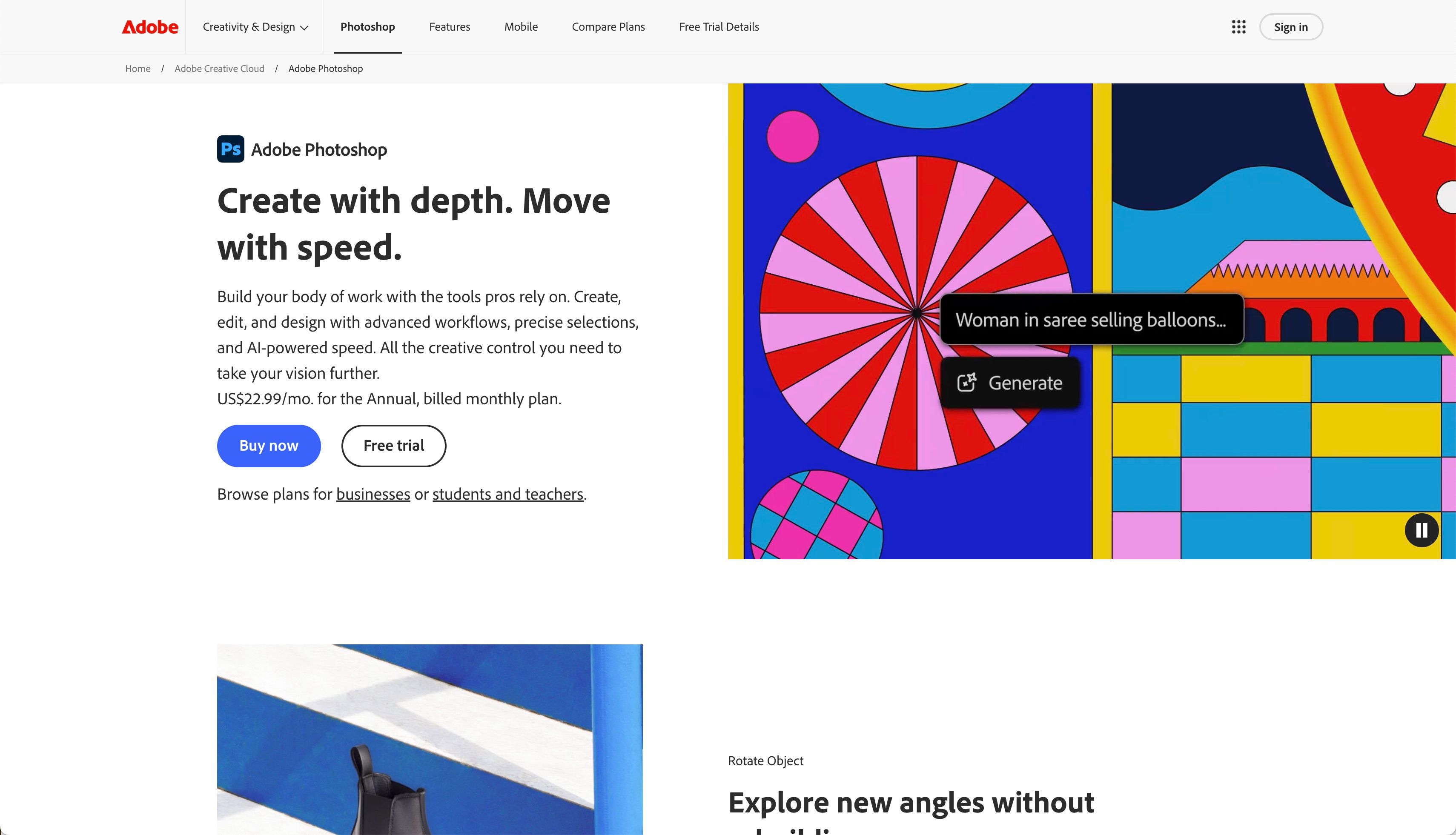
After two heroes of the digital world, it's worth remembering the one who was around before interfaces even existed as a category. Photoshop has seen it all: glossy magazine spreads, the earliest Flash websites, entire generations of banner ads. It doesn't try to compete with Figma or Sketch on their own turf — interactive interface mockups just aren't its story. But whenever you need a mockup that shows how a design will look in the physical world — branding mockups on packaging, a t-shirt, a subway poster, or stationery mockups like business cards and letterheads — Photoshop feels right at home.
The secret lies in its depth with light, shadow, and texture when building that kind of mockup — though that depth comes at a cost:
Pros
- Unmatched control over light, shadow, and texture
- Smart objects let you drop a design into a box, t-shirt, or letterhead mockup template in a couple of clicks
- Decades of accumulated tutorials and ready-made mockup templates
Cons
- Not built for interactive interface mockups
- Demanding on computer resources
- Files aren't designed for multiple people to edit at once
That's exactly why the final mockup for a client presentation is so often finished here, rather than wherever the design was originally built.
Real-world example
Branding and packaging studios traditionally wrap up their branding mockups in Photoshop. A flat logo, however clean it looks in vector form, rarely impresses a client the way a photorealistic mockup of that same box does — shown at just the right angle of light, with a soft shadow and the texture of real cardboard.
How to choose the right tool for your mockup
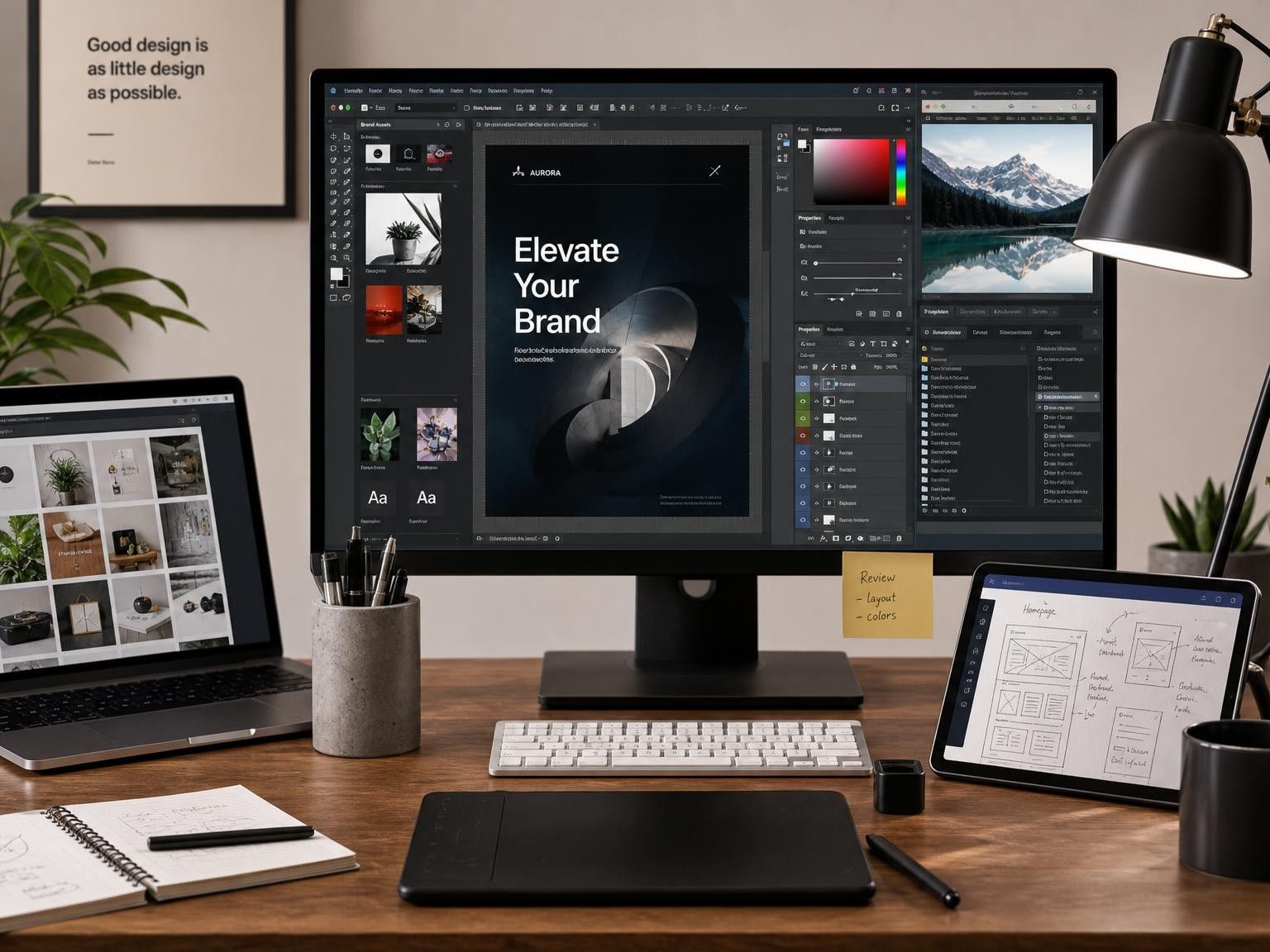
Once you understand each tool's personality, it's easier to see where your particular mockup should be built:
1. Your team is spread across cities and time zones — start in Figma; it was built for exactly this kind of workflow chaos
2. You design solo and work on a Mac — Sketch gives you speed without visual clutter
3. The final mockup needs to be a physical presentation of the design — branding mockups, stationery mockups, and print mockups are usually best finished in Photoshop
4. You need device mockups to present an interface — Figma and Sketch handle this faster, especially with ready-made plugins and frame libraries
5. You're working on a tight budget — start with free mockups; solid, ready-made templates for devices, packaging, and print can be found on resources like ls.graphics, which offers both paid and free mockups
You don't have to build every mockup in a single tool forever. Many teams today combine all three at different stages, and that combination often works better than searching for one universal solution. The most important rule is simple: don't chase the "right" tool as an end in itself. The right one is the one that lets you focus on the design itself, not on wrestling with the software.
Which One Should You Pick?
Sketch, Figma, and Photoshop aren't rivals — they're three different tools for three different kinds of mockups. One values quiet focus and precision when putting together an interface layout. Another thrives on collaboration and has reshaped how distributed teams align on device mockups together. The third turns a flat layout into a branding or print mockup you can almost reach out and touch. In 2026, strong designers are choosing less and less to commit to one tool for good — instead, they're learning to sense where to work on a given mockup right now, and keeping several tools and resources within reach.