Skeuomorphism, Neumorphism, Glassmorphism: What's the Difference and What to Choose in 2026
2026-09-24T14:10:38.826ZFive years ago, it seemed like skeuomorphism – shadows, depth, "glassy" buttons, imitation textures – was a thing of the past, left behind with early iOS. Flat design and minimalism won, and anything resembling realism in interfaces was treated as bad taste. But in 2026, the trend is reversing: realism is coming back, this time in a new, more deliberate form.
A Brief History of Styles: From Skeuomorphism to Material Design
Before digging into what's happening with realism today, it's worth seeing the whole picture – interface language has moved in waves, and each new wave was a reaction to fatigue with the previous one.
Skeuomorphism (2007–2013)
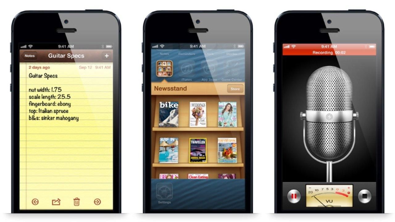
Born alongside the first iPhone: to help people quickly understand a new touch interface, designers literally copied physical objects – a notebook with stitched pages, wooden shelves, leather planners. This delivered intuitiveness through recognition: users didn't need an explanation for how the Notes app worked – it looked like a real notebook.
- Textures of real materials – leather, wood, paper, metal
- Volumetric shadows and highlights simulating physical lighting
- Direct visual metaphors from the real world
- Detail down to stitching, wear, and surface highlights
Flat Design (2013)
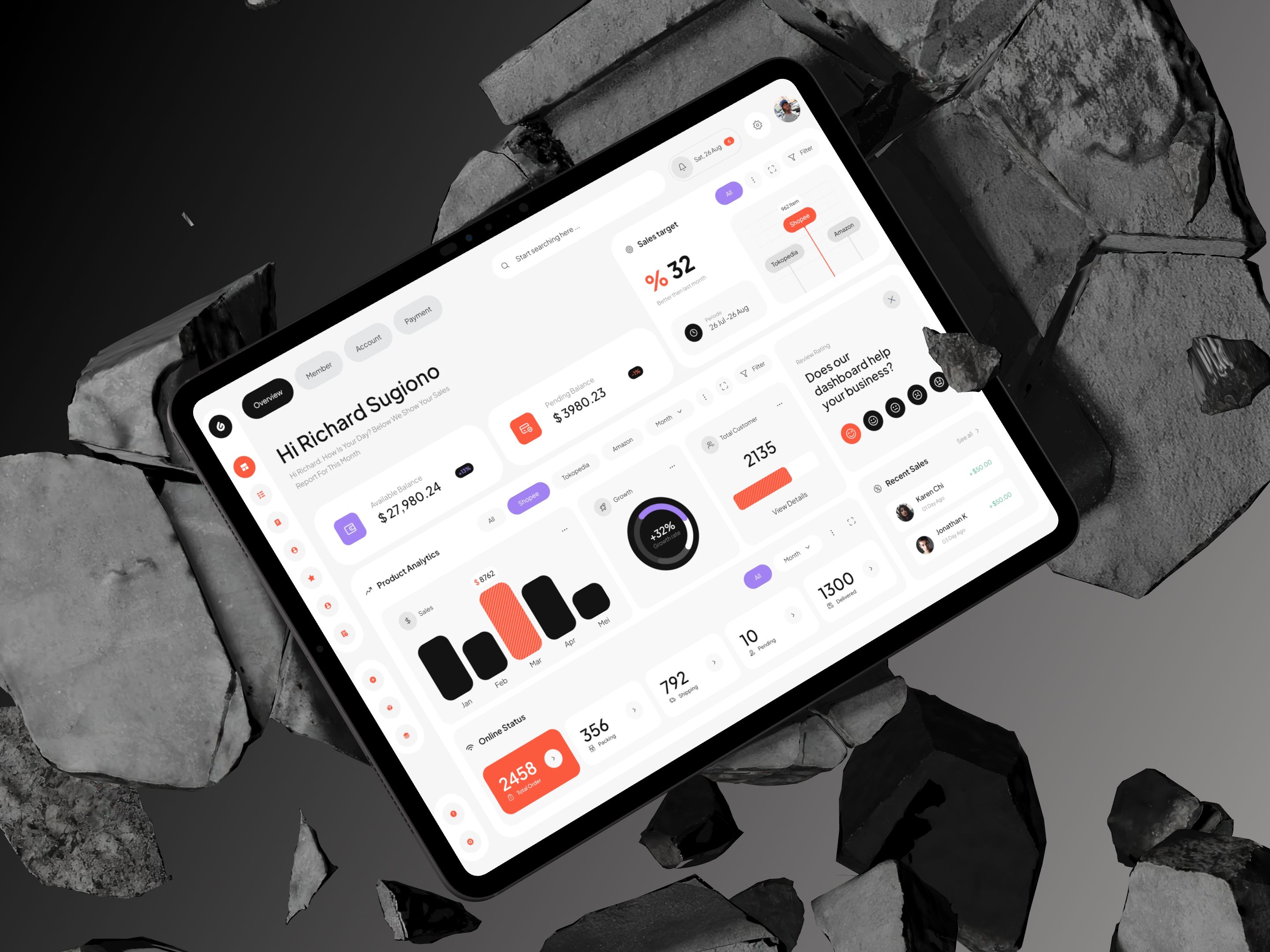
With the release of iOS 7, Apple sharply dropped textures and shadows in favor of clean colors, simple typography, and minimalism – a reaction to the visual clutter of the previous era. Flat brought speed and consistency, but paid for it with a loss of tactility.
- Solid fills with no gradients or textures
- A complete departure from shadows and depth
- Typography and color as the primary tools of hierarchy
- Simplified, geometric icons
 Made with Live Mockups, UI by Permadi Satria Dewanto
Material Design (2014)
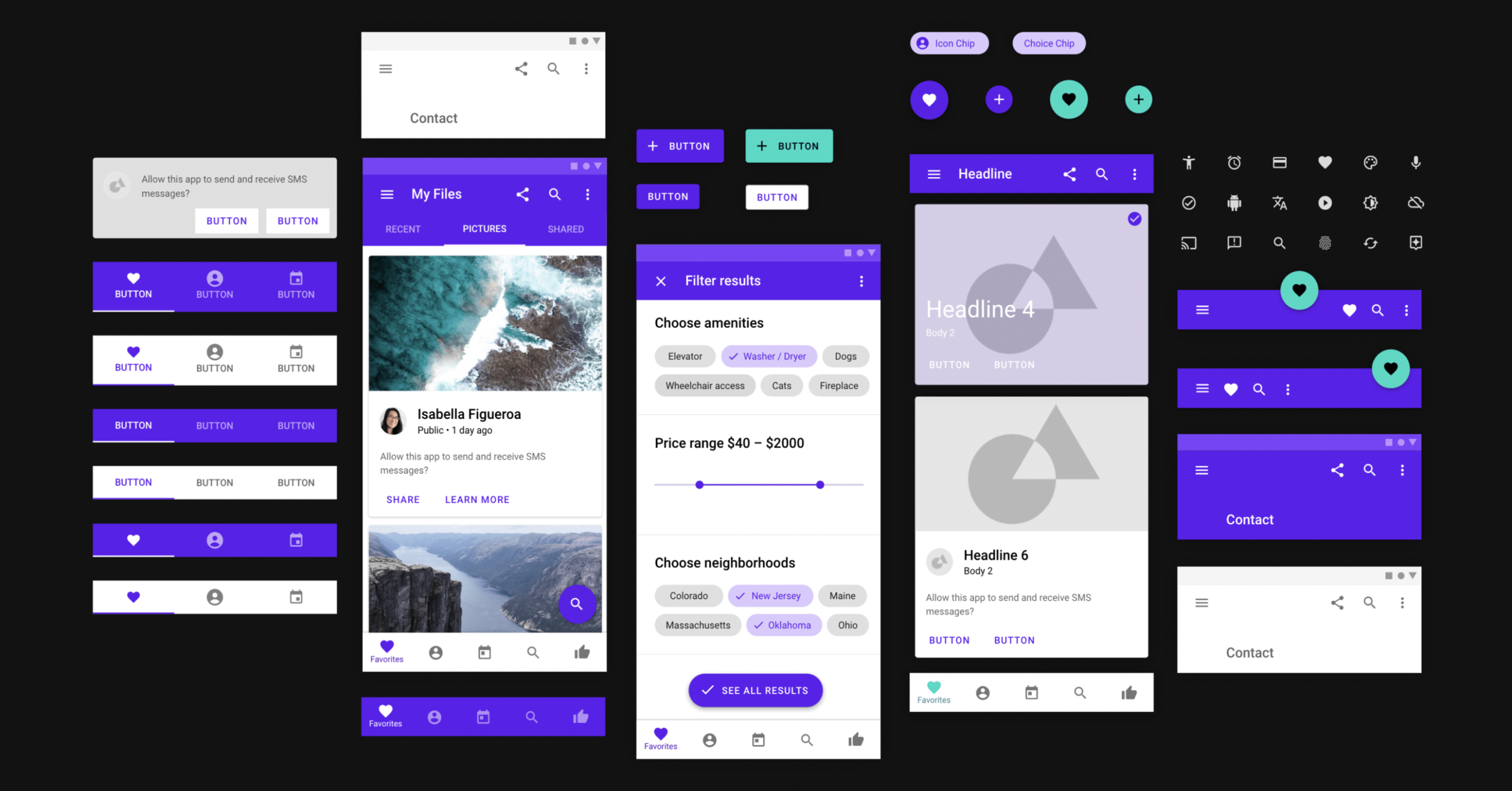
Google proposed a compromise: keep the flat aesthetic, but bring back a bit of real-world logic – through light, shadow, and "sheets of paper" that physically stack on top of each other. Material Design introduced meaningful depth, where shadows became a signal of hierarchy rather than decoration.
- A system of shadows and elevation levels showing what sits "above"
- The "digital paper" metaphor – layers that can be raised and lowered
- A unified grid and purposeful animation between states
- Rich but constrained color palettes
These three styles set up a pendulum that's still swinging today: from realism to simplicity, and back to depth again – but each time on a new turn.
 UI Design by UXPin
Where Realism Stands Out the Most
The return of depth is most visible wherever an interface is closely tied to a physical object:
– Fintech apps – cards and accounts are increasingly visualized as physical objects, with highlights and subtle perspective
– Media players and streaming services – album covers and posters now get volume and dynamic shadows
– Health and fitness apps – circular progress indicators mimic physical dials and gauges
– AR/VR interfaces – here realism isn't a trend but a necessity: virtual objects have to look believable
That's exactly why device mockups have become especially relevant again – a flat screen capture rarely conveys the depth and light these interfaces now rely on. As an interface itself becomes more "physical," the requirements for how it's presented to a client or audience change too: a flat screenshot on a white background doesn't convey highlights, shadows, and translucency well – these details get lost without context.
 Made with Live Mockups, UI by Oluwafemi Adelekan
That's exactly why realistic device mockups have become especially relevant again: they give an interface a physical frame where highlights, shadows, and volume read the way they were designed to. A design shown in an iPhone mockup or iPad mockup is perceived differently than the same screen cropped out on its own – it gains scale, context of use, and a sense of being a real product.
This isn't limited to mobile screens. Dashboards and desktop interfaces benefit especially when shown in a MacBook mockup or on a laptop mockup – the screen's glossy finish and subtle reflections only reinforce the glass effect within the interface itself. Even a basic phone mockup now plays a functional rather than purely decorative role: it shows how a volumetric interface will actually look in a user's hand, under natural lighting, and at a viewing angle close to real life.
From Neumorphism to Liquid Glass: the Second Wave of Depth
If the first wave of styles ended with material design, the language of interfaces then moved toward even greater physicality – through a flawed but telling experiment, and through a glass aesthetic that ultimately led to today's turn toward realism.
Neumorphism (2020)
A brief but telling experiment: interface elements looked as if they were pressed into or extruded from the background using soft shadows. Neumorphism made it clear that audiences missed tactility – but it failed due to low contrast and accessibility issues for people with visual impairments.
- A monochrome background that elements are "carved" from
- A dual soft shadow – light and dark – creating a raised or recessed effect
- Minimal color and contrast, with emphasis on form
- No clearly defined edges on elements
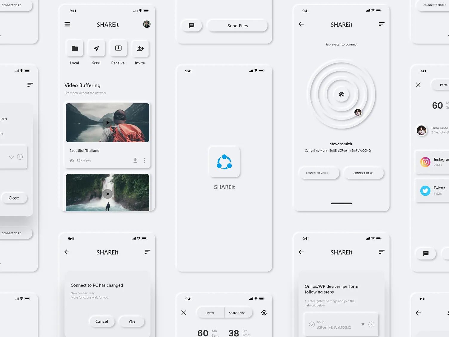 UI by Tanzir Fahad
Glassmorphism and Frosted UI (2017–2021)
Alongside neumorphism, another line was developing – the glass aesthetic. Frosted UI arrived with Microsoft's Fluent Design (the Acrylic material) and took hold in macOS and iOS through system panels: an interface element blurs whatever sits behind it while staying translucent, like frosted glass. Glassmorphism took shape a bit later as its own trend after macOS Big Sur launched, and went further – glass panels started being used not just for system layers but for full cards and modals too.
- Background blur under a translucent panel
- A thin light-colored border mimicking a glass edge
- A bright, often gradient background behind cards – glass reads better against contrast
- Soft shadows for a sense of the layer "floating" above the surface
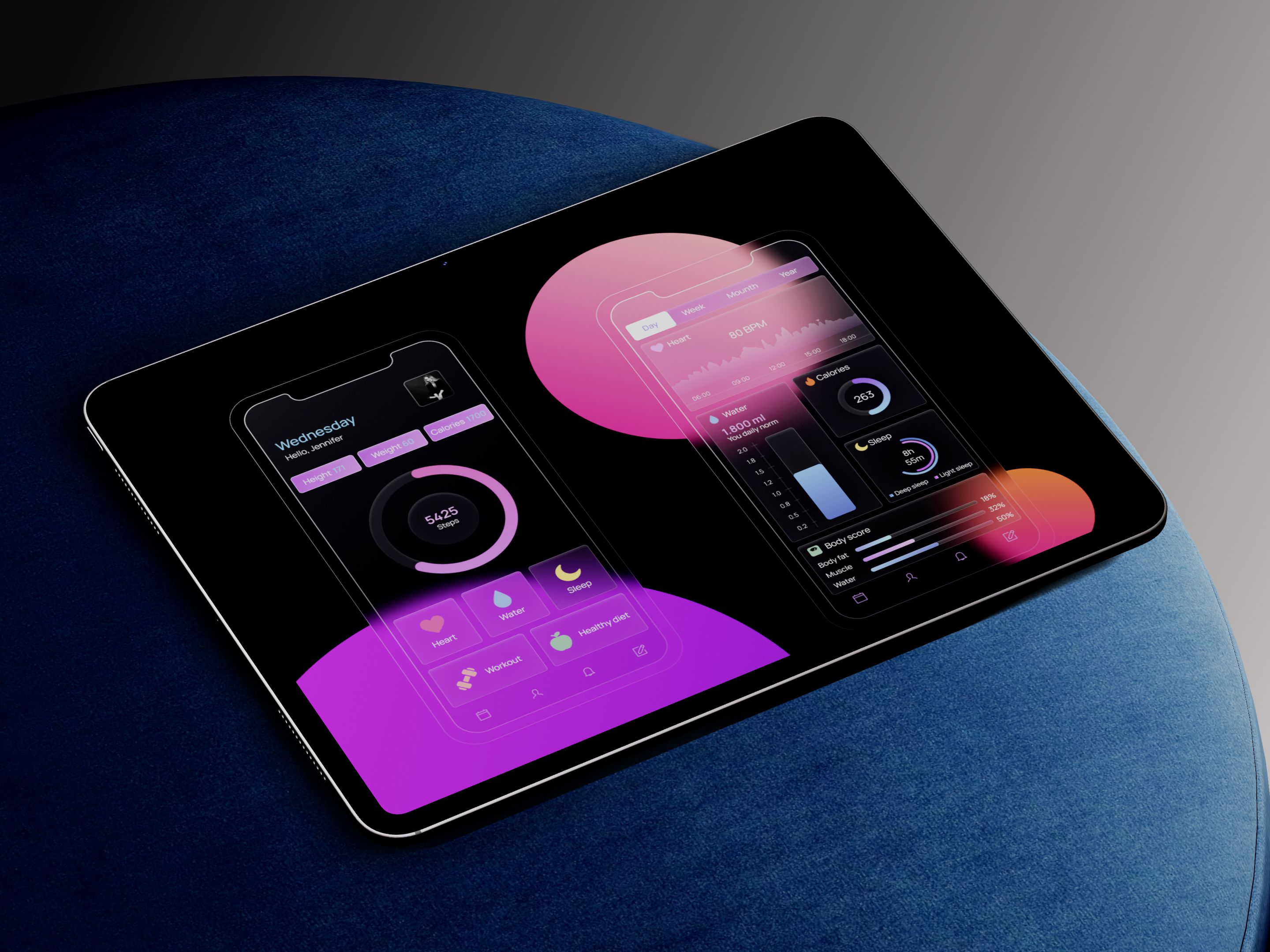 Made with Live Mockups, UI by Карина Водяницкая
The Next Generation of Realism — Liquid Glass (2026)
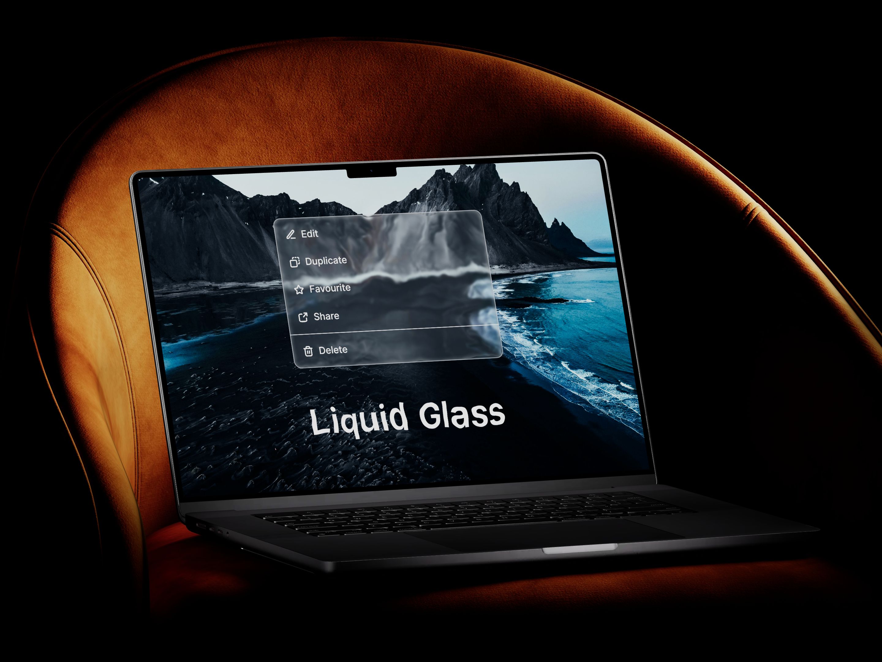
Today's turn takes the lessons of every previous stage into account: it borrows the depth of skeuomorphism, the speed of flat design, the meaningful shadows of material design, and the glass aesthetic of glassmorphism – while avoiding their mistakes through controlled contrast.
– Depth without excess – volume exists, but it serves function rather than decoration
– Materiality through light, not texture – glass, not leather or wood
– Dynamic response – the interface reacts to motion and context instead of staying a static image
– High contrast for elements against any background – a lesson drawn from the failures of neumorphism and heavy-handed glassmorphism
Made with Live Mockups, UI by Roohi Koohi
A designer who worked on early versions of iOS once noted that the best interface is one that doesn't need to be explained. That's exactly the principle the industry is returning to: realism here isn't about looks – it's about intuitiveness.
Which Style Should a Designer Choose Today
Having gone through the history of styles – from skeuomorphism to frosted UI, glassmorphism, and Liquid Glass – a practical question comes up: what should you actually use in your current project? There's no single answer: the choice depends on the product, the audience, and the task, not on whatever is trending.
– If the product is about speed and data – work tools, B2B dashboards, financial reporting – stay closer to flat or material: minimal decoration, maximum readability, depth only where it helps with hierarchy. This is also where a laptop mockup does more work than a glossy device shot: it presents dense data screens in the context they're actually used in, without adding visual noise.
– If you need to highlight one or two system layers – a popover menu, a side panel, a notification – frosted UI fits well: a light blur behind a translucent panel shows that an element is temporary and sits "above" the content, without distracting decoration. It's worth previewing this on a phone mockup, since notification blur reads very differently at actual screen size than it does zoomed in on a canvas.
– If the product is built around emotion and a sense of "premium" – a luxury brand, a lifestyle app, a product showcase – a more expressive glassmorphism can work: bright gradient backgrounds, heavy blur, and thin light borders on cards create a multi-layered glass effect that reads well in a portfolio or on a landing page.
– If you need a balance between visual impact and functionality – a product's core interface rather than one accent screen – Liquid Glass is the fit: the same glass aesthetic, but subordinated to hierarchy and with controlled contrast, without glassmorphism's risks to readability. For a desktop-first product, that balance is easiest to judge in a MacBook mockup, where reflections on the glass screen echo the glass effect in the UI itself.
– If the interface deals with money, health, or other sensitive data – contrast and accessibility matter more than visual flair. Use any "glass" depth very selectively here, following the lessons of neumorphism: any effect that reduces readability isn't worth it.
– If the product is part of AR/VR or uses the camera and real-world surroundings – realism here isn't decoration but a necessity: virtual elements have to look believable next to real objects. Since this kind of feature usually ships on Android before anywhere else, it's worth testing it in an Android mockup too, not only on iOS.
– If the brand is already established and has been through several styles – you don't have to chase the trend wholesale. It's enough to add a frosted layer or some volume selectively to key screens (onboarding, the main dashboard, a showcase), keeping the rest of the interface light and fast.
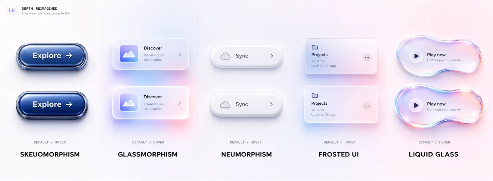
The general rule is simple: depth is a tool, not decoration, and different "glass" styles carry different costs for that tool – from an almost imperceptible frosted layer to full-blown glassmorphism. It's justified only where it helps the user understand what they're looking at, and what they can do with it, faster.
Conclusion
Skeuomorphism hasn't returned in the literal sense – no one is bringing back leather calendars or wood-paneled bookshelves in interfaces. But the principle behind it – recognizability through physical metaphor – is back at the center of design thinking. Having gone through flat, material design, neumorphism, and glassmorphism, the industry has returned to depth, but now with all the previous mistakes accounted for: Liquid Glass, volumetric indicators, and material textures in 2026 solve the same problem skeuomorphism did fifteen years ago, just more elegantly and functionally.
For anyone working with interfaces like these, it's not just about designing depth and light correctly – it's about presenting them correctly too, whether to a client, an investor, or a portfolio audience. The team at ls.graphics regularly covers trends like this and how to best present them through realistic device mockups.