From Box to Bottle: 8 Package Mockups Every Brand Designer Should Have on Hand
2026-09-30T15:00:57.200ZPackaging design rarely lives on a flat canvas for long. A label that looks perfect as a vector file can fall apart the moment it wraps around a padded mailer, or gets lost in the fold of a paper bag. Testing a design across different package mockups early saves a lot of guesswork later — and it's the fastest way to catch problems before a client, or a production line, does.
Why Shape Changes Everything
A flat mockup and a real package aren't just different in presentation — they're different physical objects, and physics has opinions. A glossy plastic bag catches studio light very differently than a matte pouch. Metallic surfaces, like a bubble mailer, reflect and distort a logo in ways no flat comp will show. Even hand-held scale plays tricks: a design sized for a desk render can look completely different once it's photographed in someone's actual hand.
This is why packaging is one of the few areas of design where "it looks right on screen" genuinely isn't enough proof. The package format isn't a neutral container for the design — it actively reshapes how the design is perceived, before a single customer even reads the label.
Eight Formats Worth Testing
1. Floating Plastic Bag Mockup
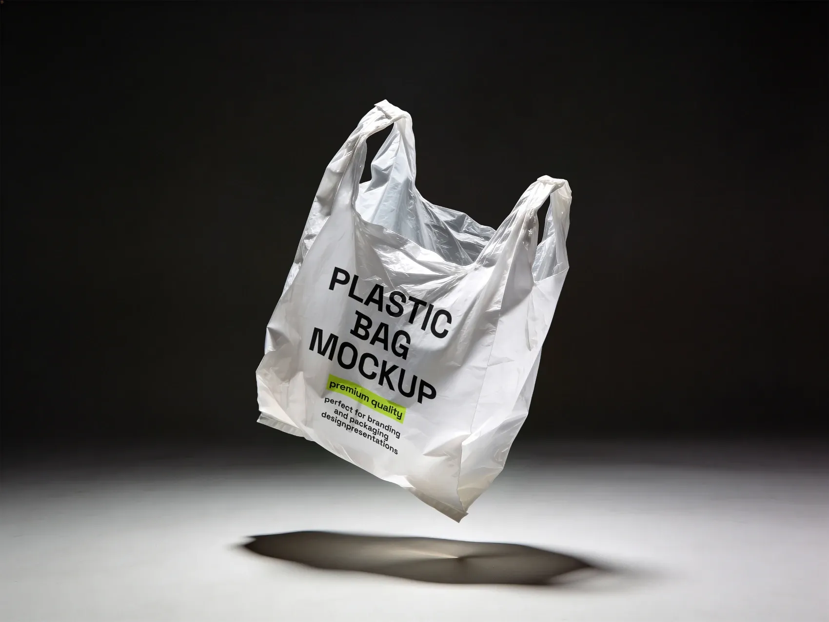
A glossy plastic shopping bag shown mid-air, with natural folds and dramatic lighting. Glossy surfaces bounce light unpredictably, which makes this a useful stress test for how a logo holds up on a reflective, non-flat surface.
Use case: a retail brand checking whether its logo stays crisp across the bag's natural creases, not just on a smooth render.
2. Lemon Carrier Box Mockup
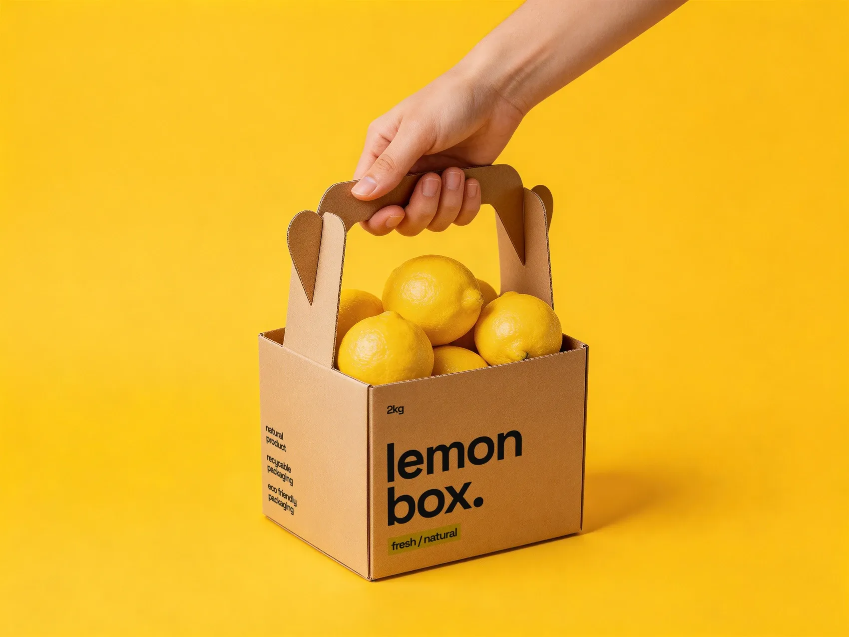
A kraft cardboard carrier filled with fresh produce, shown with natural hand interaction. Among box mockups, this is one of the more literal — the rough cardboard texture and organic contents make it a strong test for how "clean" a design can stay in a genuinely food-adjacent context.
Use case: a fresh-produce brand checking whether its typography still reads clearly against kraft cardboard grain, not just white board.
3. Paper Kraft Shopping Bag
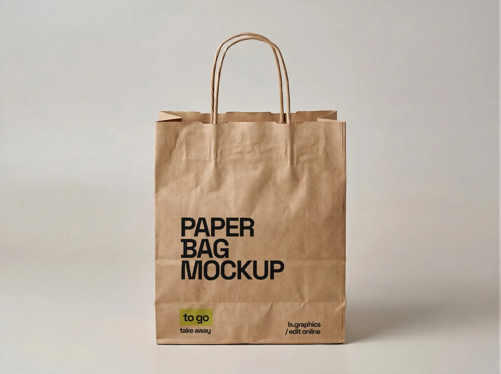
A kraft paper bag with twisted handles — the retail and café staple. Because it's carried in public, this format is less about close-up legibility and more about whether a mark reads instantly from a few steps away.
Use case: a café confirming its logo is recognizable at a glance when a customer walks out the door holding the bag.
4. Paper Coffee Cup Mockup
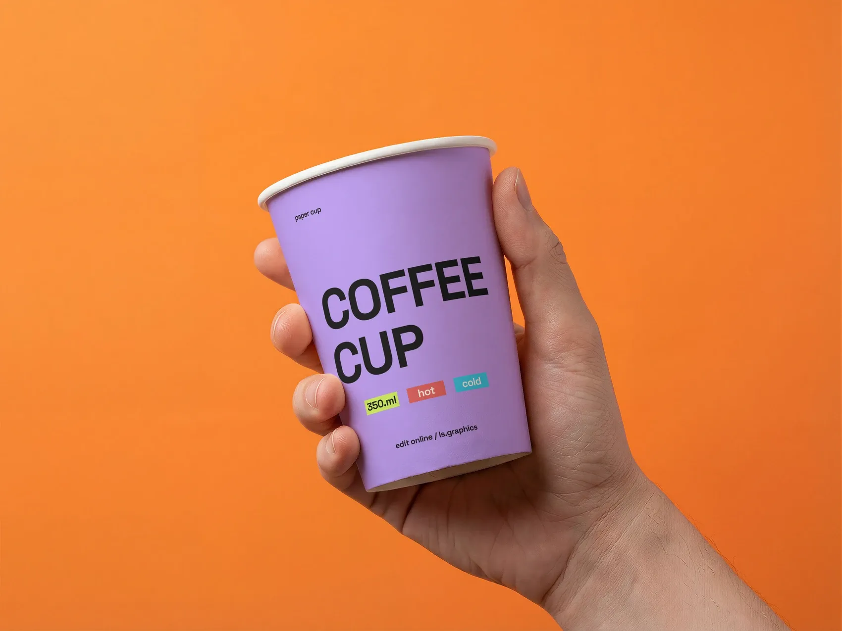
A disposable coffee cup shown in hand, angled to display the branding clearly. Held mockups like this are useful because they show a design at true social scale — the size it's actually seen at by other people, not just the customer.
Use case: a coffee shop checking whether its wordmark is still legible when the cup is angled naturally in someone's grip.
5. Paper Bag Mockup
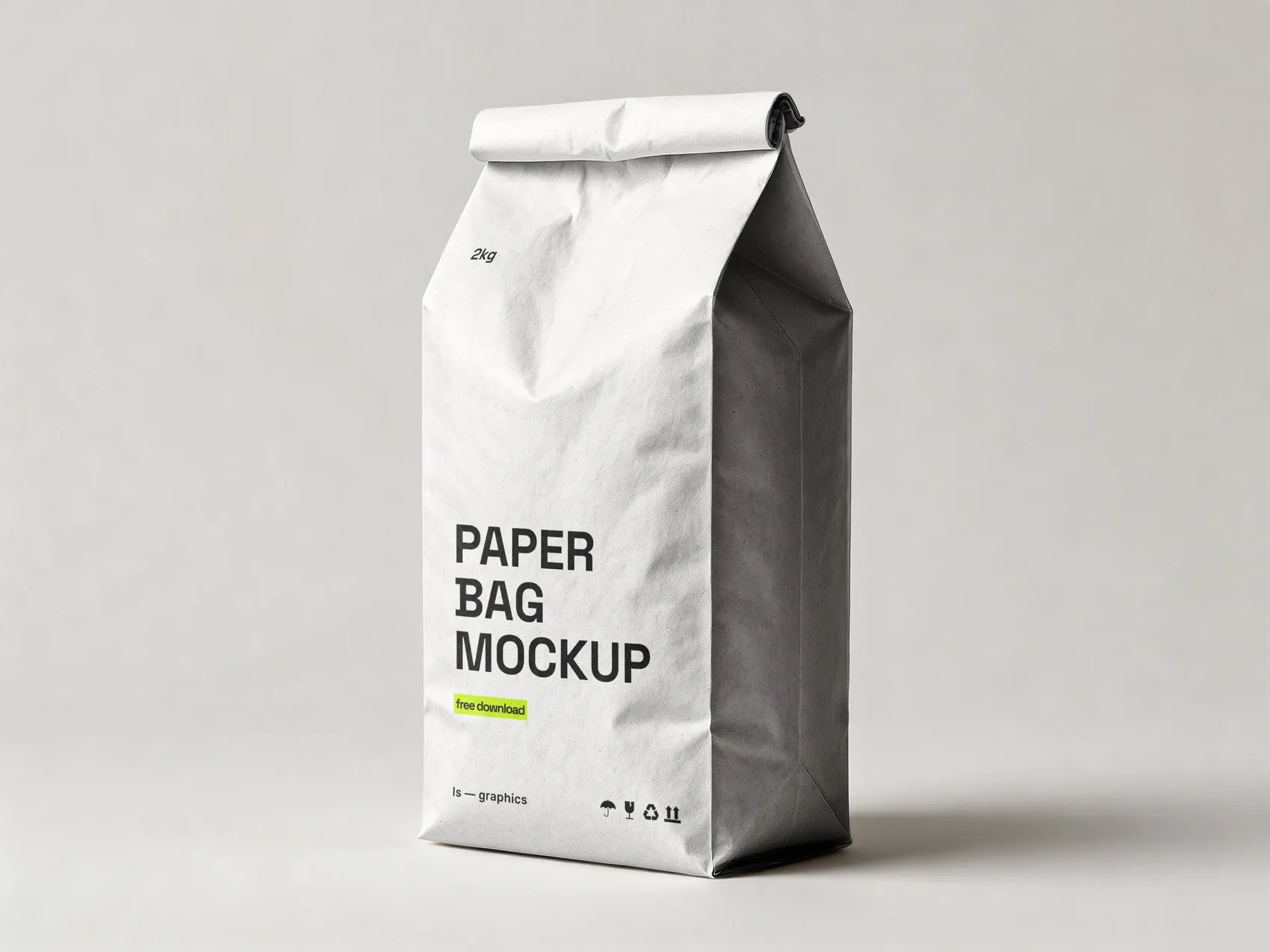
A folded-top paper bag typical of food takeaway packaging. Its simple silhouette makes it a good baseline test for legibility once a design is reduced to a small, unadorned surface.
Use case: a bakery confirming its pattern doesn't get lost once compressed onto a small, folded paper surface.
6. Metallic Bubble Mailer Mockup
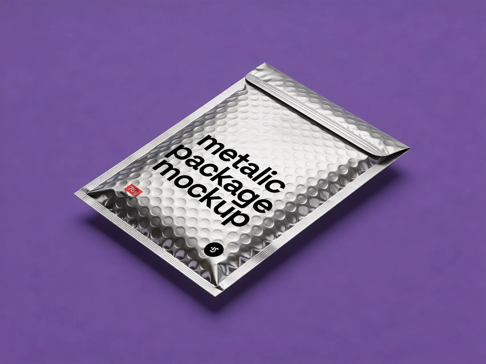
A reflective silver shipping mailer with visible bubble padding texture. The metallic surface is one of the more demanding tests in this list — it distorts color and contrast in ways glossy plastic or matte paper never will.
Use case: an e-commerce brand checking whether its logo stays legible against a reflective, textured mailer surface before it ships to customers.
7. Standing Pouch in Hand Mockup
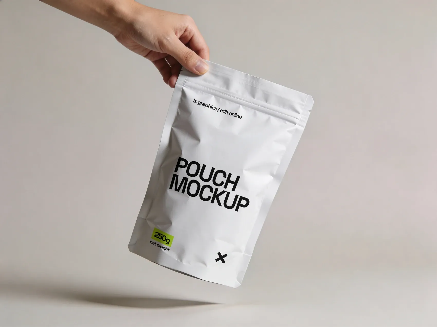
A resealable standing pouch with a matte finish, shown held in hand — a format used across coffee, snacks, supplements, and cosmetics. Because it's photographed in use, it reveals how a design behaves on a surface that's gripped, tilted, and creased rather than sitting flat on a shelf.
Use case: a supplement brand checking whether dosage information stays readable once the pouch is squeezed and angled in hand.
8. Spray Can Mockup
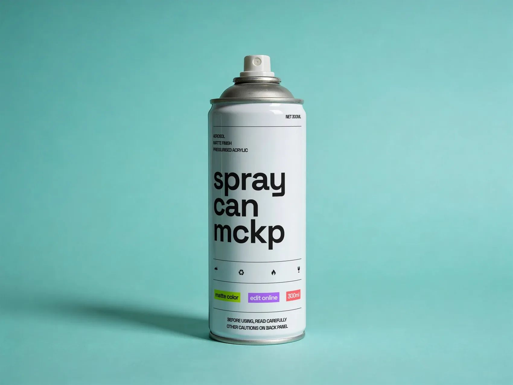
A matte-finish aerosol can, relevant well beyond paint — cosmetics, automotive, and household brands all use this format. Its cylindrical body and matte surface make it a useful counterpoint to the metallic mailer: same category of wraparound design, very different light behavior.
Use case: a household-goods brand testing whether its color-coded cap system stays distinguishable once wrapped around the can's curve.
Common Mistakes When Skipping the Mockup Stage
Mistake 1: Designing only as a flat file.
A layout gets approved as a clean render, and nobody notices that the fine print disappears into a fold, or that a mark lands right where a hand naturally grips the pouch — issues invisible on screen, obvious the moment someone actually holds the package.
Mistake 2: Treating every format as interchangeable.
A kraft shopping bag and a metallic mailer are both packaging, but they carry completely different expectations — one signals eco-conscious retail, the other signals premium e-commerce. This is exactly where branding mockups earn their keep: testing the same layout across formats quickly shows where that mismatch actually lives.
Mistake 3: Ignoring material and light.
Matte paper, glossy plastic, and reflective metallic film all handle color differently. A palette that looks rich on a glossy plastic bag can turn muddy on a matte pouch, or distort entirely on a bubble mailer — a difference no flat comp will show.
Mistake 4: Designing at the wrong scale.
A mark sized for a desk render can look oversized on a small coffee cup and disappear entirely on a large carrier box. Without testing actual proportions, scale mistakes only surface after printing.
Mistake 5: Picking the package format last.
Choosing a soft standing pouch over a rigid box, or a paper bag over a metallic mailer, already tells the customer something before they read a word of copy. Treating the format as a late, purely practical decision skips a real branding opportunity.
What ties all five together is timing: every one of them is cheap to fix on screen and expensive to fix after printing. Catching them early isn't extra polish — it's the difference between a design that survives contact with its real shape and one that only ever worked as a picture of itself.
Conclusion
None of these eight formats is inherently "better" than another — they solve different problems, and increasingly, they say different things. A carrier box or paper bag tells you if a mark reads from a distance; a pouch or coffee cup tells you if it survives being held; a metallic mailer or spray can tells you if it survives reflection and curvature. Testing across all of them, the way a solid set of branding mockups allows, catches the kind of mistake that's invisible on a flat canvas but obvious the moment a design meets its actual shape — and picking the right one in the first place is itself a design decision, not just a production detail.
For anyone building out a packaging system rather than a single asset, the team at ls.graphics keeps a growing library of formats like these ready to test against.