Animated vs. Static Mockups: Which to Choose for an App Presentation
Every app needs a stage. Before a single line of marketing copy gets read, someone looks at a picture of your product — and that picture decides whether they keep scrolling or lean in. Good UI presentation is what turns a plain screenshot into something people actually want to look at. The question is simple to ask and surprisingly hard to answer: should that picture move, or should it stand still?
Static Mockups: The Reliable Workhorse
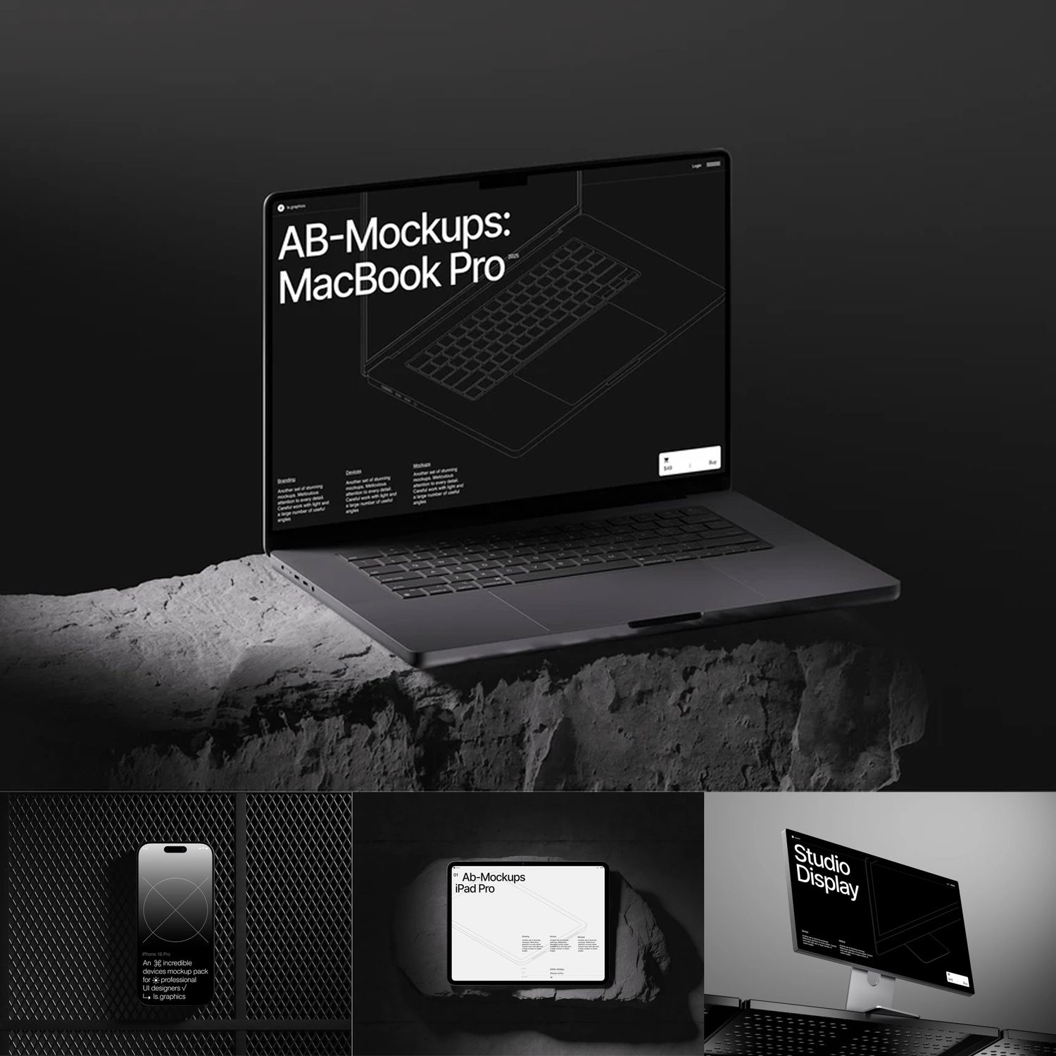
A static mockup is a single framed image — your app screen placed inside a phone, laptop, or tablet shell. No motion, no interaction, just a clean shot.
Pros:
- Loads instantly, anywhere — App Store listings, PDFs, printed decks
- Cheap and fast to produce in bulk
- Universally compatible; no video codecs or JS to worry about
- Easy to keep consistent across a whole set of screens
Cons:
- Can't show flows, transitions, or gestures
- Blends into a feed full of other still screenshots
- Says less about how the app feels to use
For ready-made static scenes, libraries like ls.graphics — the studio behind mckp.live — offer high-quality device mockups and branding mockups used by teams at Nike, IBM, and Adobe.
Animated Mockups: The Attention Grabber
An animated mockup adds movement — a phone rotating, a screen sliding in, a cursor triggering a zoom, or a full interactive 3D scene someone can click around in.
Pros:
- Demonstrates real interactions: swipes, taps, scrolling, onboarding
- Naturally stops the scroll on Instagram, Dribbble, or a landing page
- Feels closer to using the actual product
- Works as a hero video, a GIF, or a live embed depending on the platform
Cons:
- Larger file sizes and longer render/export times
- Needs a bit more design and tooling know-how
- Overused motion can distract from the actual UI
Best Online Tools for Animated Mockups
A handful of tools have made animated presentation realistic for teams without a motion designer or a dedicated UI design department on staff:
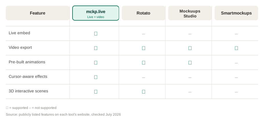
1. mckp.live — builds interactive 3D device mockups that can be embedded live on a site (Webflow, Framer, or plain HTML) or exported as video for Instagram, Dribbble, and Behance. It includes pre-built animations like enter, loop, and breathing effects, plus cursor-aware camera moves, so a scene can react to a visitor without any custom animation work.
2. Rotato — a desktop app focused on turning static screenshots into 3D-rotated video mockups, popular for App Store preview videos.
3. Mockuups Studio — a browser-based mockup generator with both static and simple animated templates for quick social exports.
4. Smartmockups — known mainly for static scenes, but offers limited motion templates for short promo clips.
Most of these tools follow the same basic workflow: drop in a screenshot or screen recording, pick a device and animation style, then export as a video file or, in some cases, embed the scene directly as live, interactive code.
Real Cases Where Motion Wins
Animated mockups aren't a theory — they show up constantly in shipped work. On Dribbble and Behance, case studies for app redesigns routinely lead with a looping device animation instead of a flat screenshot, because it holds attention in a feed people scroll through in seconds. Instagram and TikTok product teasers almost always use a moving mockup — a phone tilting to reveal a UI, or a screen recording dropped into a rotating device shell — since static images rarely survive the scroll on those platforms. SaaS and app landing pages increasingly embed an interactive 3D mockup directly on the homepage instead of a plain hero image, letting visitors nudge the device with their cursor before they've read a word of copy.
Which One Should You Choose?
There's no universal winner — only a better fit for the moment. Use static mockups for App Store listings, spec sheets, print materials, or anywhere loading speed and simplicity matter more than spectacle. Reach for animated mockups when you're presenting a flow, launching on social media, or building a landing page where the first three seconds decide whether someone keeps reading.
Many teams end up using both: static frames for documentation and quick reference, animated or interactive ones for the moments that need to earn attention. The format is a tool, not a philosophy — pick the one that matches where your audience will actually see it. Whichever route you take, a thoughtful UI presentation is what makes a good product actually look like one.
Read next
From Box to Bottle: 8 Package Mockups Every Brand Designer Should Have on HandSeptember 30, 2026
Skeuomorphism, Neumorphism, Glassmorphism: What's the Difference and What to Choose in 2026September 24, 2026
Sketch vs. Figma vs. Photoshop: Where to Work with Mockups in 2026August 27, 2026
5 Gradient Generators Every Designer Should Bookmark in 2026August 13, 2026