Tracking vs Kerning vs Leading — the difference in 30 seconds
Ask five designers to explain tracking, kerning, and leading, and you'll likely get five different answers — a couple of them confidently wrong. All three sound like synonyms for "the space between things," so they get swapped without much thought. But mix them up where it matters, and a headline looks cramped or a paragraph turns into a wall of text nobody wants to read.
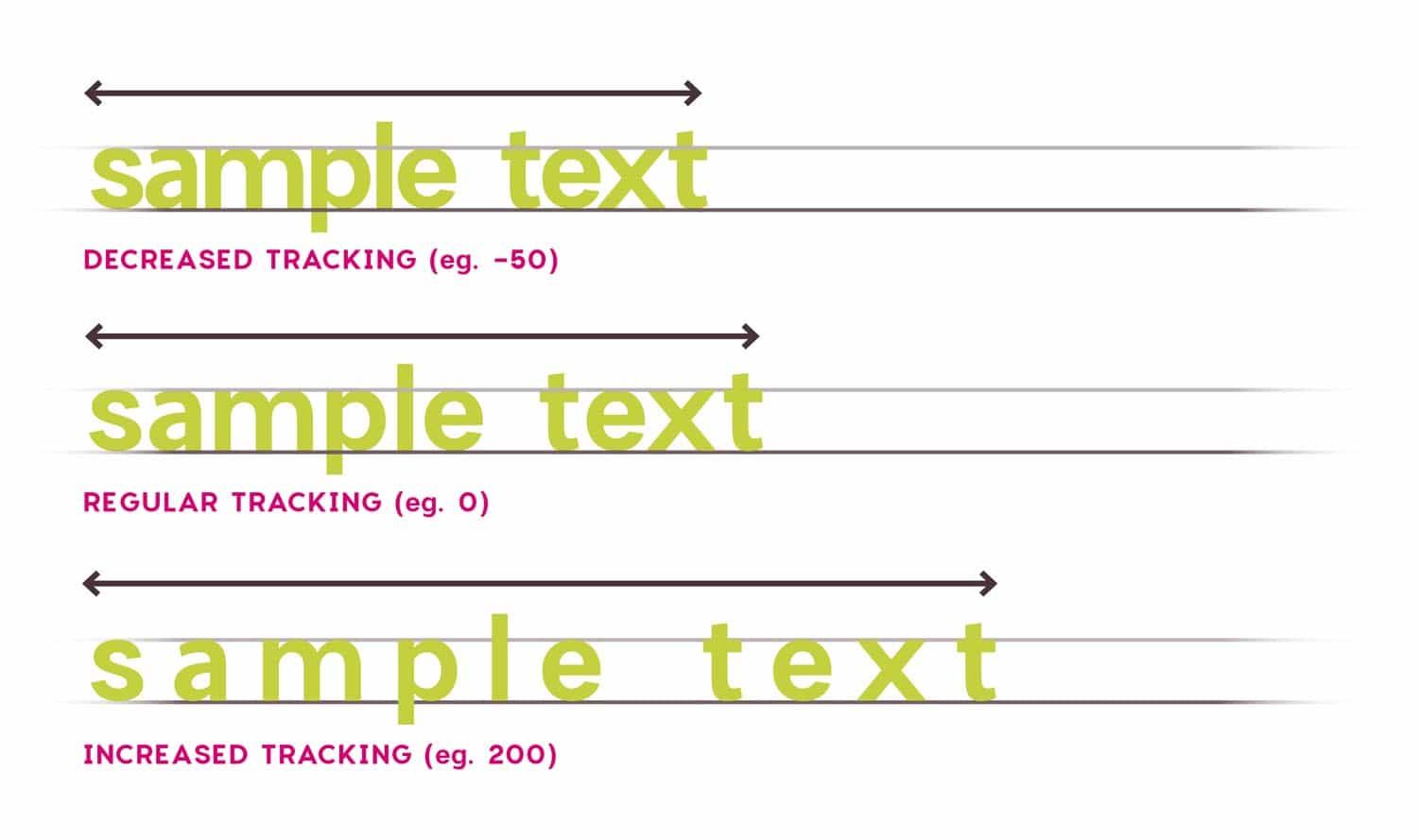
Tracking — the space between all letters
Tracking is a uniform change in the spacing between letters across a whole word, line, or block of text. Adjust one value, and the entire text expands or tightens as a whole.
Use tracking when you need to fit a line into a set width or make a headline feel airier or more compact. All-caps text almost always benefits from a touch of positive tracking.
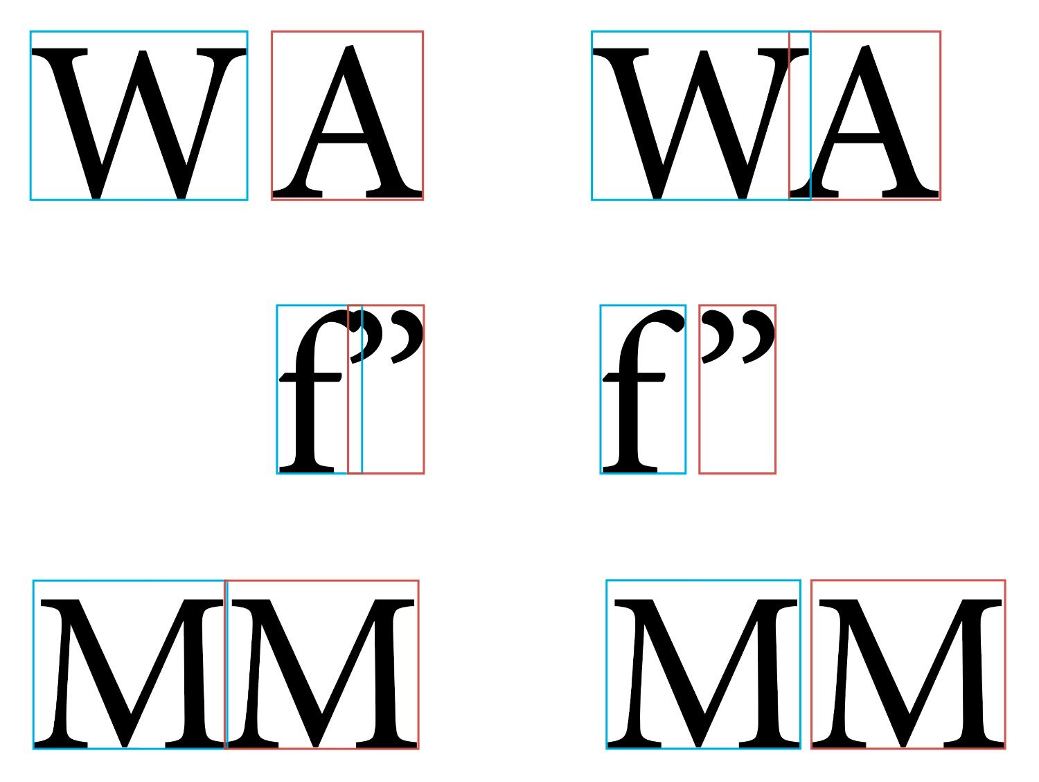
Kerning — the space between a letter pair
Kerning is a targeted adjustment of the space between two neighboring characters, rather than the whole text.
Classic examples: pairs like "AV," "WA," and "To" — without manual correction, they either leave an awkward gap or the letters crowd together. Fonts already ship with built-in kerning tables, but designers often fine-tune specific pairs by hand in headlines and logos.
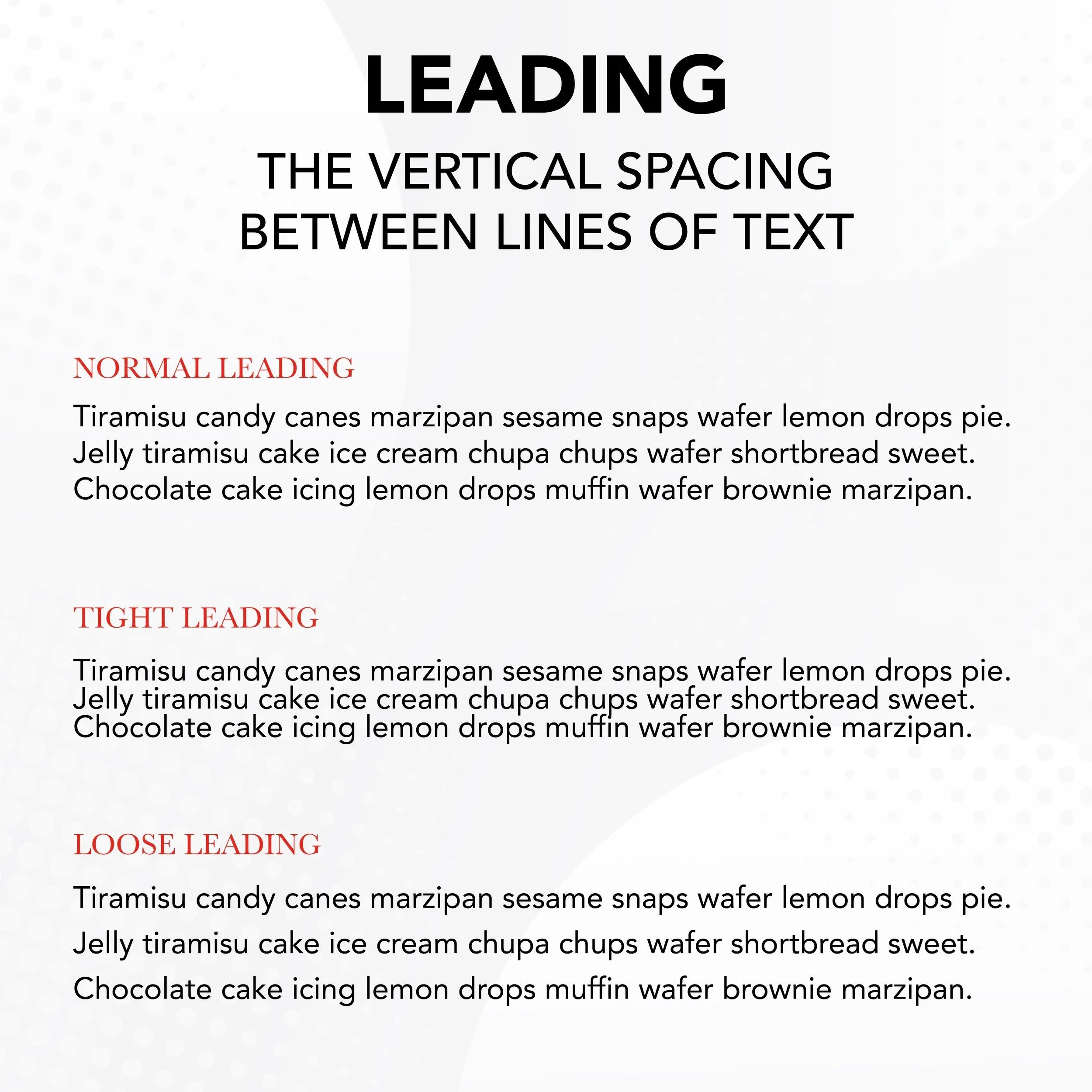
Leading — the space between lines
Leading is the vertical distance between lines of text, measured from one baseline to the next. The term comes from the era of hot metal typesetting, when thin strips of lead were literally placed between lines of type.
Tight leading makes a paragraph feel heavy; leading that's too loose breaks the visual connection between lines. A comfortable value for body text is roughly 120–145 percent of the font size.
The 30-second cheat sheet
| Term | Controls | Applies to |
|---|---|---|
| Tracking | All spacing across the text | A word, line, or block |
| Kerning | Spacing between one letter pair | Two adjacent letters |
| Leading | Spacing between lines | A paragraph |
In short: tracking is about the whole text, kerning is about a single letter pair, and leading is about lines.
Testing typography under real conditions
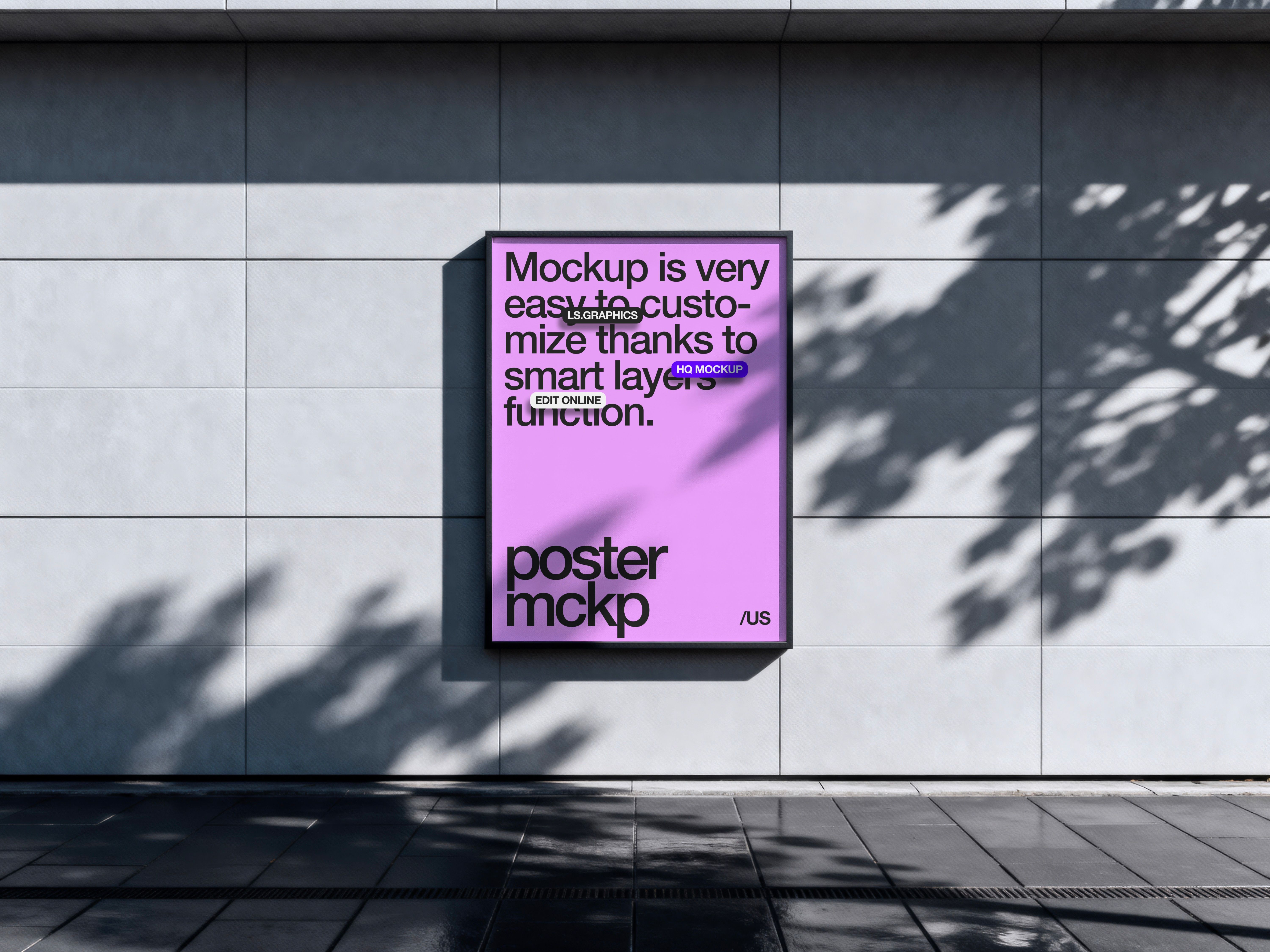
The same tracking and leading settings look different on a flat artboard versus on an object shown in perspective — viewing angle and surface curvature change how letter spacing reads. That's why it helps to test the final typography directly inside a presentation mockup rather than on a flat canvas.
For that, the Figma plugin Mockup — Devices, Print, Warp & Distort does the job well: it maps text onto packaging, device, and print mockups with realistic perspective, so you can immediately see whether the text stays legible after the distortion.
For more mockups and typography resources, check out ls.graphics.
Conclusion
Tracking, kerning, and leading are three tools serving the same goal: making text readable and visually balanced. Tracking works on the whole block of text, kerning targets individual letter pairs, and leading governs the space between lines. Understanding the difference saves hours of tweaking and helps you spot the real cause faster when a layout just "doesn't read" at first glance.
Read next
From Box to Bottle: 8 Package Mockups Every Brand Designer Should Have on HandSeptember 30, 2026
Skeuomorphism, Neumorphism, Glassmorphism: What's the Difference and What to Choose in 2026September 24, 2026
Sketch vs. Figma vs. Photoshop: Where to Work with Mockups in 2026August 27, 2026
5 Gradient Generators Every Designer Should Bookmark in 2026August 13, 2026